TfL Digital products are designed according to our design language. Rooted in the spirit of Henry Beck’s original Tube map and wayfinding signage, removing clutter and presenting the essential information with a bold clarity.
We design our digital products to be used by all Londoners, with accessibility and inclusivity in mind.
The design of digital displays is no exception. Because of the way customers interact with them at a distance and at a glance, layout and typographic choices make a huge impact on a display’s legibility and clarity.
These guidelines enable us and our partners to design inclusively and thoughtfully; Avoiding visual clutter, optimising space, highlighting essential information and aligning with TfL’s design language.
Colour
There are five core colours used across our digital displays.
Johnston Black #03071C
Used for typography on white backgrounds and occasionally as a background for white typography.
White #FFFFFF
In most screens, this is the default background.
Grey 50 #C1C8D2
Used in graphic elements and boundaries to structure layouts.
Beck Blue #0019A8
Sometimes referred to as Corporate Blue or TfL Blue. It is used to provide reassurance, highlighting good service. Never associated with disruption.
Yellow #FFE500
Used to identify disruptions. Never associated with good service.
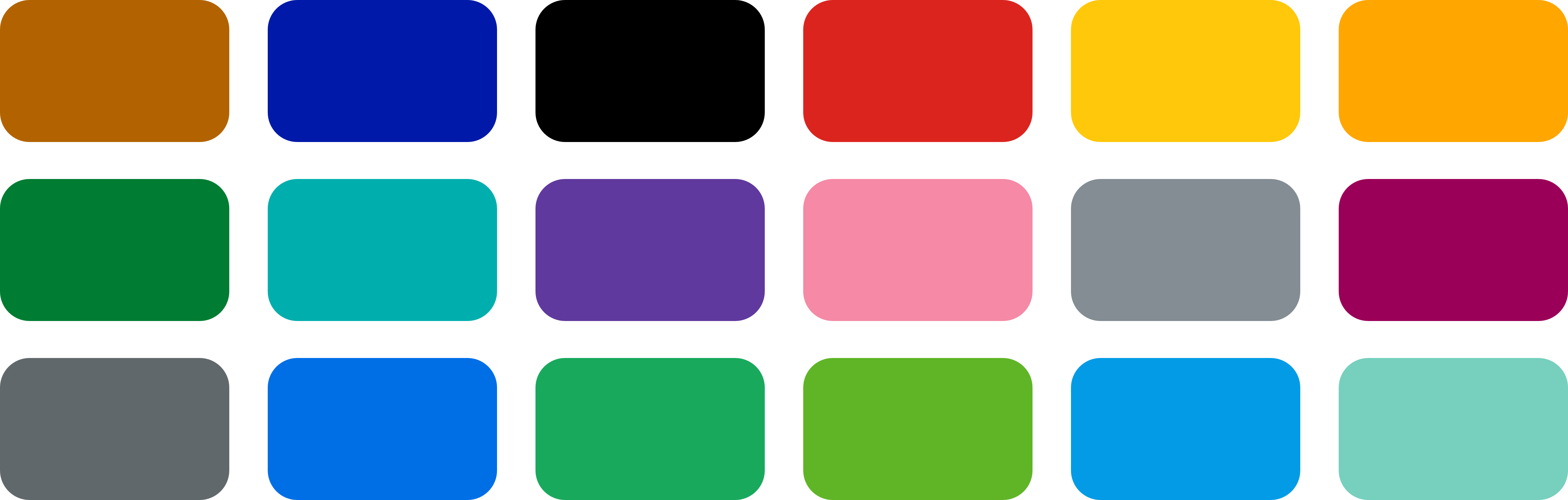
TfL’s service colours are also present on digital displays, when sharing service-specific information.
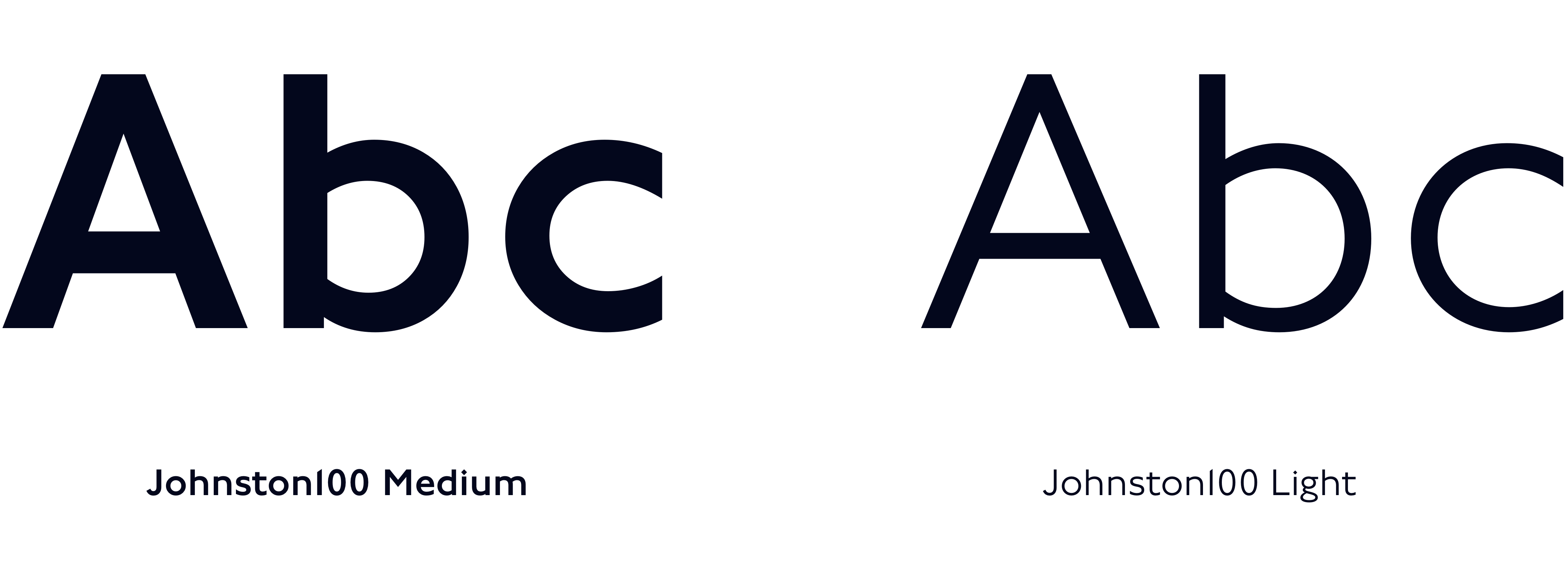
Typography
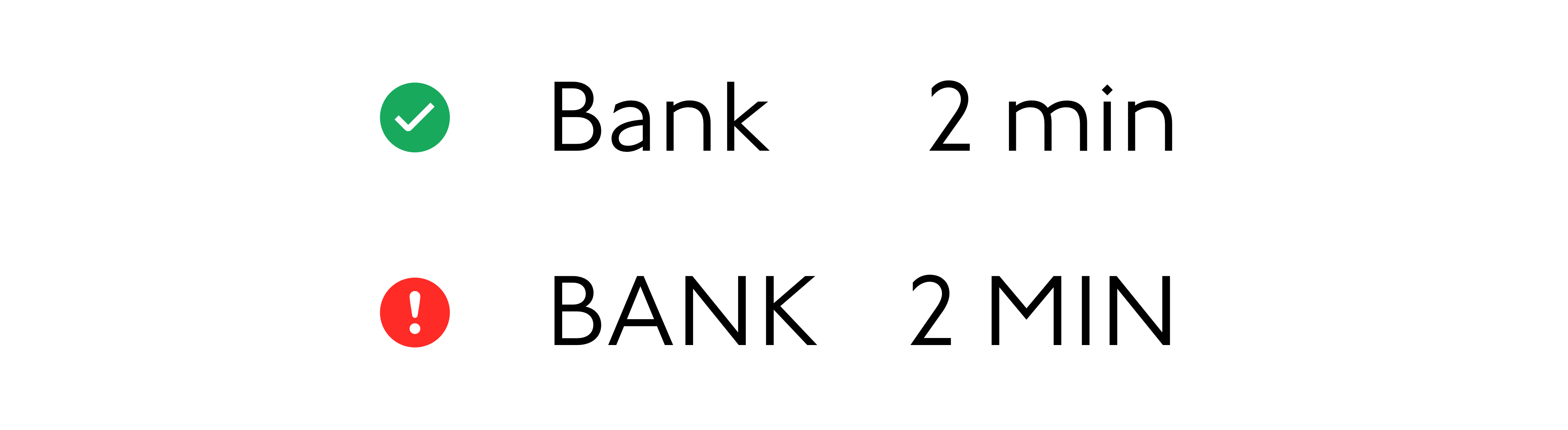
Our typeface is Johnston100. On digital displays, we mostly use Medium and Light weights. Text is set in sentence case, never in all capitals.
Text size
Most often on digital displays, big, bold, clear text is preferred.
The minimum text size on a display should be decided according to the distance it needs to be visible from.
- Are customers seeing this display from across a station entrance concourse?
- Or are they seeing this display from inside a bus shelter?
Consider the height at which a display is installed. How high up is the first line of text in the display in relation to the viewer’s eye level?
To design inclusively, using as benchmark the eye level height of 1060mm (measured vertically from the ground) is recommended.
This is the eye level height of the 5th percentile adult female wheelchair user as set out by the Network Rail ‘Electronic Visual Customer Information Systems’ document (ref: NR/L2/TEL/30130).
As a rule of thumb, the further and higher up the display, the bigger the text.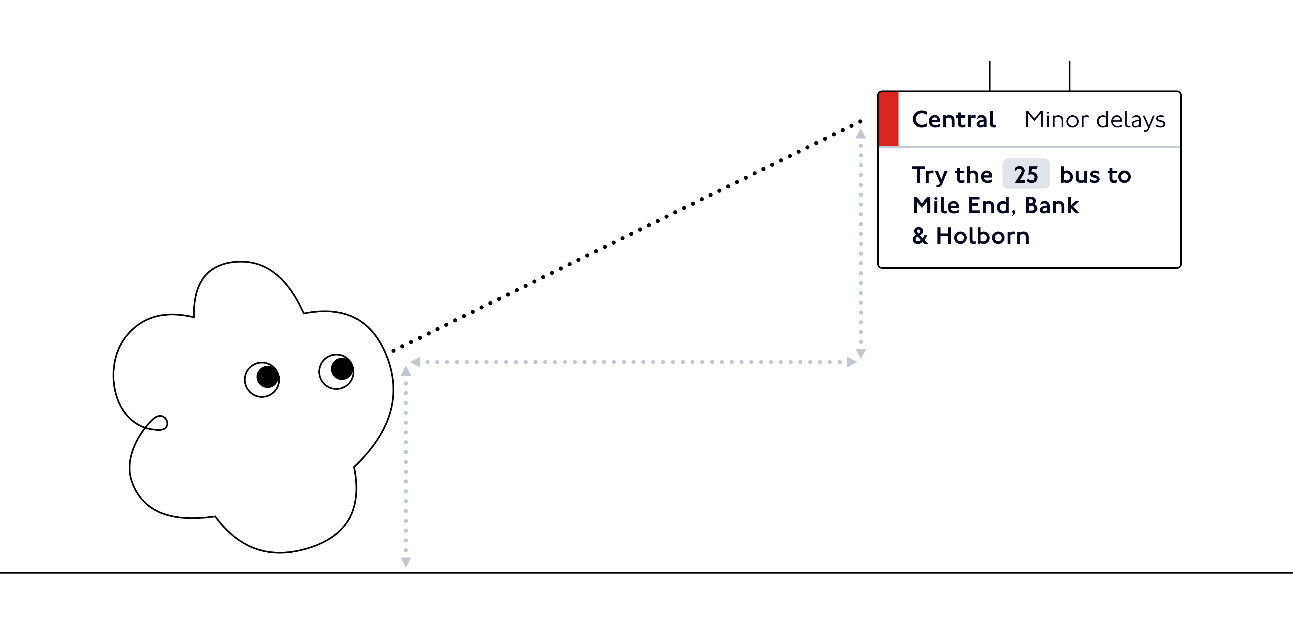
Other aspects also impact text size:
- The light in the physical environment may decrease the visibility of the display and require a bigger text size to be legible.
- The time a customer would typically spend engaging with the display. For most screens, this will be a split-second. However, based on the information they’re sharing and their placement, some screens may be consulted for a bit longer, and these factors might make a smaller text size suitable.
Text hierarchy
Text size is key to establishing a clear visual hierarchy of information in your display. After defining the minimum legible text size for your display, build a set of text sizes (ideally no more than two or three).
Choosing a bold, clear header size, a smaller general use text size, and in some cases, a slightly smaller size for secondary information will make for a legible and coherent display.
Icons
Icons are an integral part of the TfL visual language, from mapping to interface interactions. They have clear meanings across touchpoints.
On digital displays we use icons rarely and carefully, in large part because it can be hard to see them clearly from a distance.
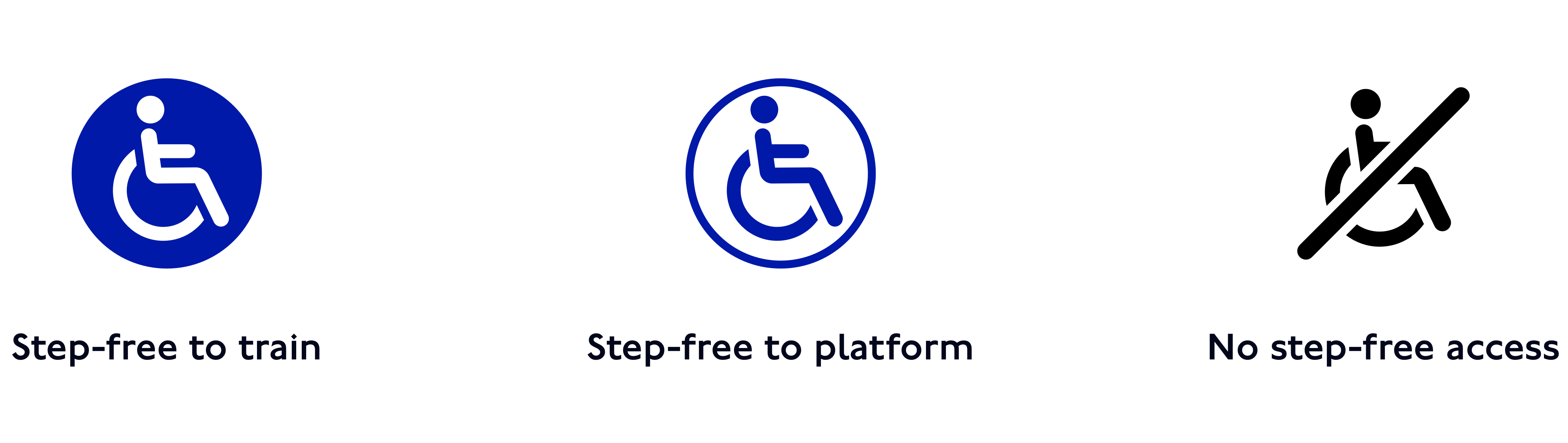
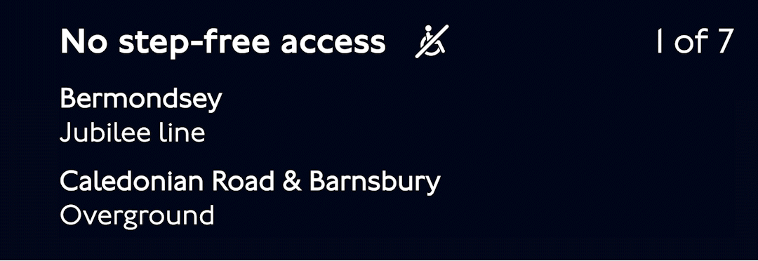
Step-free icons
Icons are essential to communicating about step-free access.
Stations and platforms are assigned a step-free access type according to their infrastructure
When step-free access is partially or fully unavailable at a station due to a temporary issue, these icons can be used as alerts.
Note that these are not to be used without text description.
A neutral step-free icon can be used to identify general step-free information.
Other icons
The alert icon can be used to help communicate travel disruptions.
Usage rules
- Do not use an icon unless it is necessary, prioritise words for communication.
- Do not enlarge an icon to use as an illustration.
- Do not use an icon as a decorative element.
- Do not change the colour of step-free icons.
Please get in touch with us to request a full set of icons.
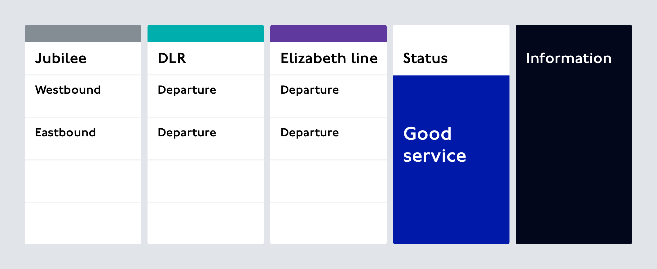
Layout
As with everything on digital displays, context is key.
The role of the screen, along with the text size and the size of the screen need to be considered to choose an appropriate layout. Read more about the role of a digital display.
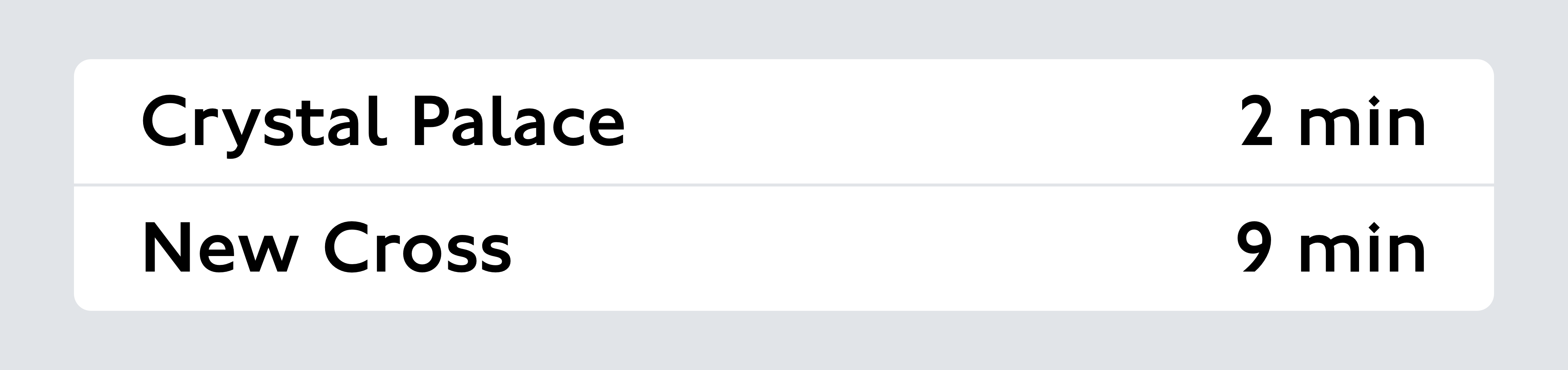
For instance, a small narrow screen on a platform:
- should be visible from a distance, throughout the length of the platform.
- should share essential information at this moment in the customer journey: service departures for this platform, their destinations and departure times.
This screen should have big text and a simple, easily glanceable layout, without too many sections or non-essential information.
On the other hand, a large, wide display installed higher up at a station:
- should be visible by many customers at once, from a range of distances.
- could share a wider range of information relating to a variety of customer journeys.
This screen could handle multiple clearly laid out sections, sharing live information about different lines and departures.
However, the text size would still have to be an appropriate size to be legible at a distance by customers entering the station.
Regardless of scale, TfL digital displays should aim for a bold, spare composition with plenty of padding and space.
The layout should allow customers to quickly scan the screen and understand essential information.
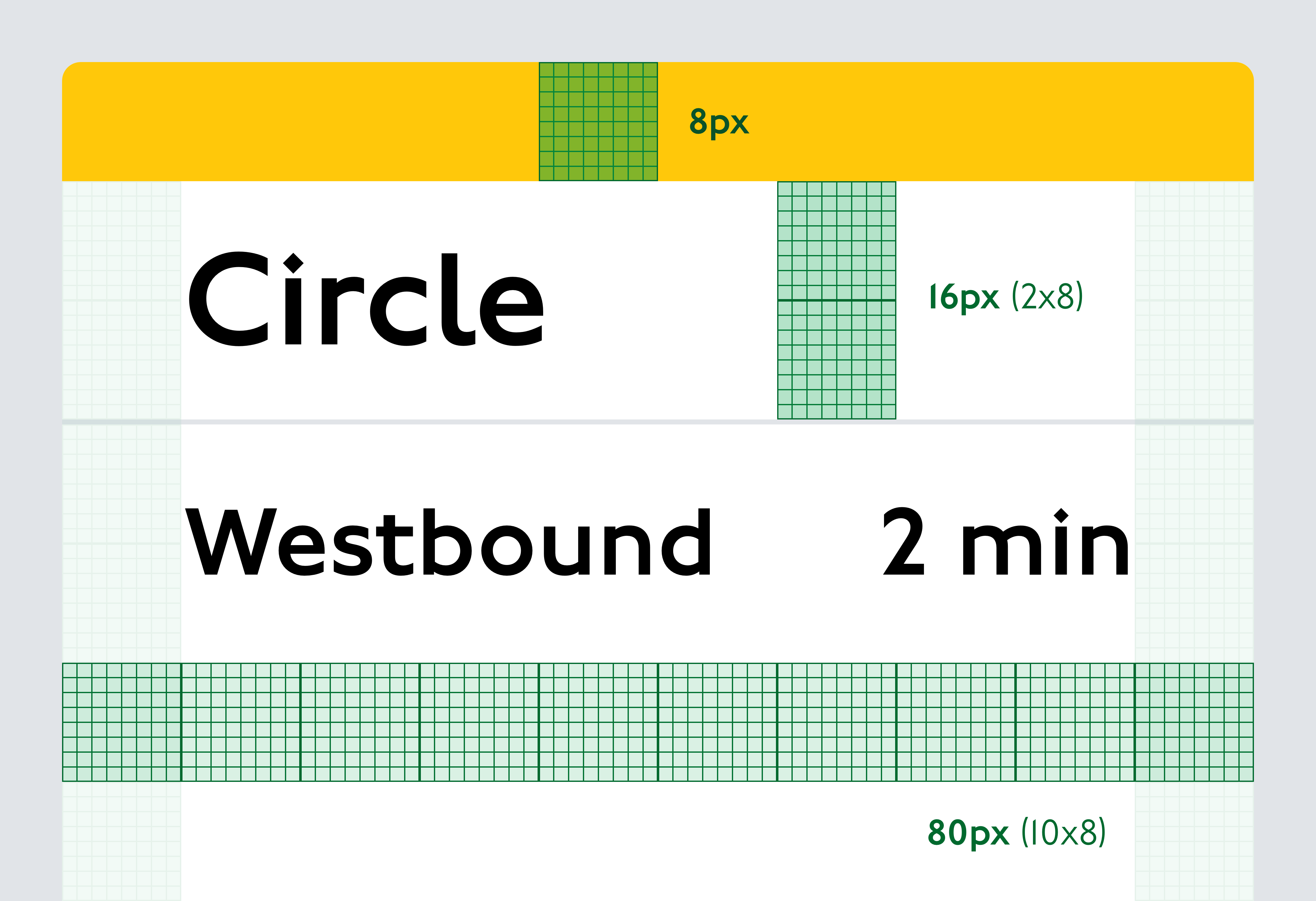
Structure
We recommend using an 8pt system. This means using a minimum unit of 8px and multiples of 8 (16, 24, 32, 40…) to set out layout areas and margins.
Even though it’s always best to design at the correct resolution for the intended screen, using this 8px rule means designs are less likely to be distorted if they have to be scaled up. It avoids areas ending up on half pixels and looking blurry and less precise from a distance.
Using these units to set layout areas as well as vertical spacing for text will create a more aligned, well structured design.
Animation
Motion or animation should be used carefully and sparingly on digital displays.
The aim is always to display persistent information that won’t change while customers are trying to read it.
Unnecessary motion can create inconsistency and frustration and can make displays hard to read for many customers.
However, some motion is essential to displaying live information, and good animation can even support the meaning of what’s happening on the network.
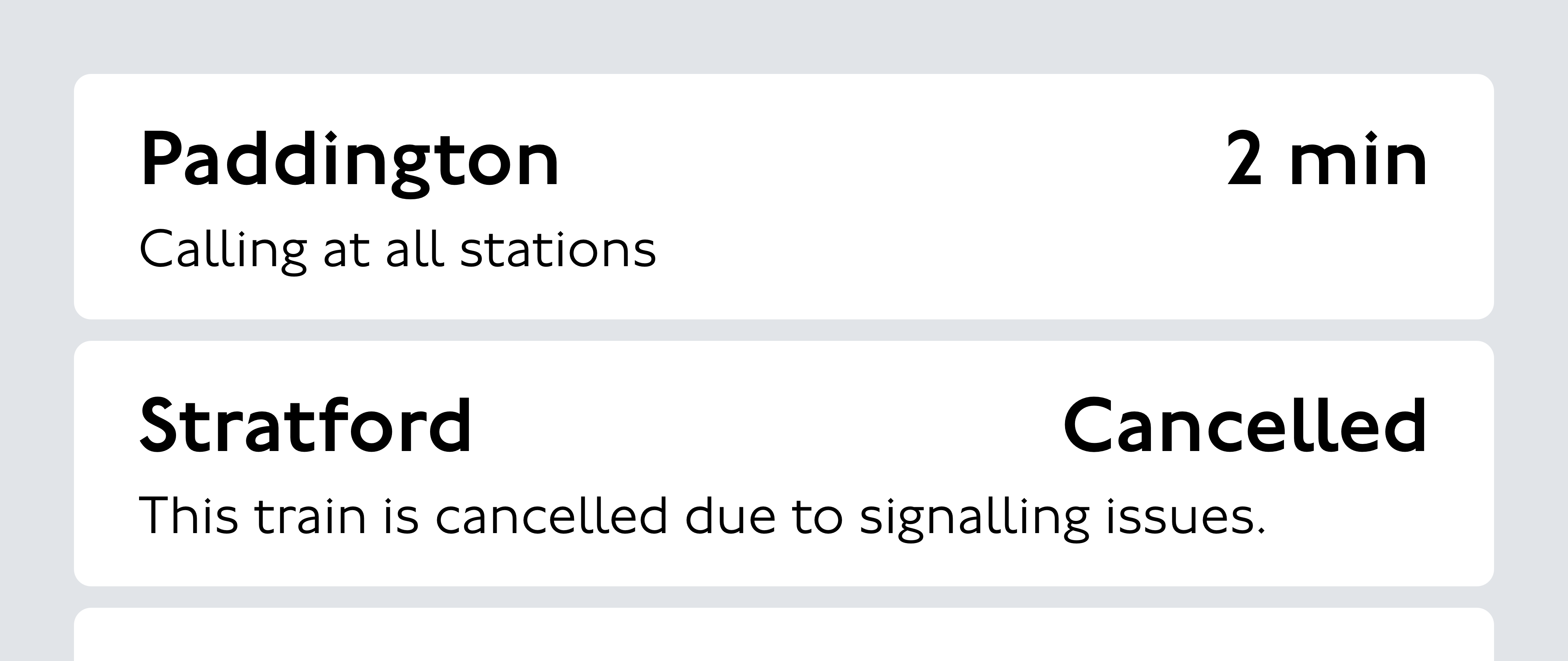
Information refresh
A refresh in information should draw attention, but not be alarming. For instance, when a service on a departure board has left the station, it needs to be removed from the board in a way that looks intentional and understandable.
Pagination
Animation can also be used as a way of managing larger volumes of information than the screen size can handle. Some displays need to share more information than can fit in one static frame.
Often, we use pagination to manage overflow, showing one page at a time and marking the page as one of more so customers are aware an area will paginate.
Scrolling
Rarely, we also use scrolling, often on smaller elements of text. When animating text, it’s essential to allow plenty of time for customers to read.

To get in touch with the Digital team, contact [email protected]
© Transport for London