The TfL digital design language is rooted in the spirit of Henry Beck’s original Tube map and wayfinding signage, removing what is not needed and presenting the essential information with a bold clarity.
In the same way the Tube map and wayfinding signage was designed to enable users to reach their destination, the digital language also aims to allow all users to access information with a minimum of fuss.
Colour
There are three core colours used across all channels.
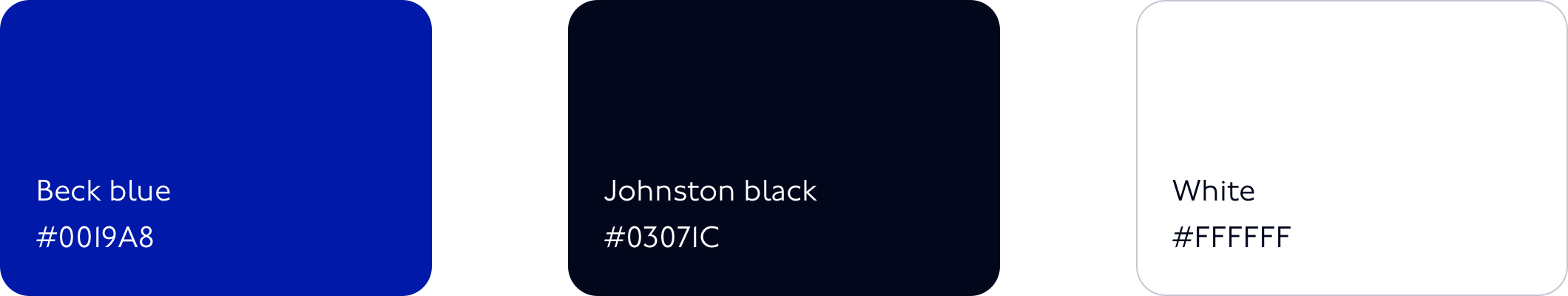
Beck Blue
Corporate Blue or TfL Blue. It is used to provide reassurance, highlight good service and for primary buttons.
Johnston Black
This blue-black has been chosen to reduce eye strain while retaining the appearance of black. Johnston Black is primarily used for type.
White
Use plenty of white. It’s our default canvas.
Proportions of core colour usage across all channels

Spacing
Spacing tokens are primarily used in padding and margins to remove guesswork and create consistency in layout and UI.
| Token | Pixel |
|---|---|
spacing-1 |
4px |
spacing-2 |
8px |
spacing-3 |
8px |
spacing-4 |
12px |
spacing-5 |
16px |
spacing-6 |
24px |
spacing-7 |
32px |
spacing-8 |
40px |
spacing-9 |
48px |
spacing-10 |
64px |
spacing-11 |
96px |
spacing-12 |
160px |
Typography
Our typeface is Johnston100. Line height is 1.5x type size in accordance with WCAG 2.1 requirements. Links are underlined.
We don’t use any other colours for type than a blue-black we call Johnston Black #03071C.
| Token | rem | Pixel |
|---|---|---|
h1 |
2.3rem | 42px |
h1-mobile |
1.8rem | 34px |
h2 |
1.4rem | 26px |
h3 |
1.16rem | 21px |
bold |
1rem | 18px |
p |
1rem | 18px |
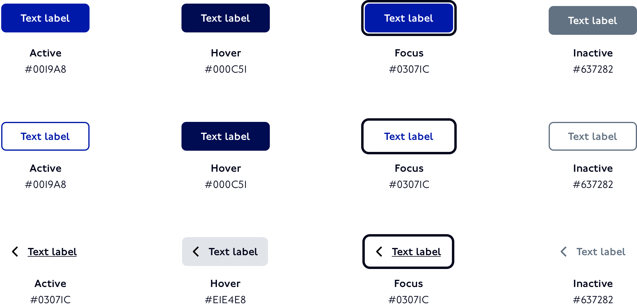
Buttons
There are three button types: primary, secondary and text button.

Primary buttons
Used when there is a single clear definitive action. Aim for one primary action per page.
Secondary buttons
Used when there is more than one choice or for a lower priority action. There can be more than one secondary button per page.
Text button
Text buttons are often used with an icon to reinforce meaning, then can exist without an icon if there is sufficient context to show interactivity such as within a card or navigation UI. They can also be used for lower priority actions.
States
Buttons have four states: active, hover, focus and inactive.
Button sizes and padding
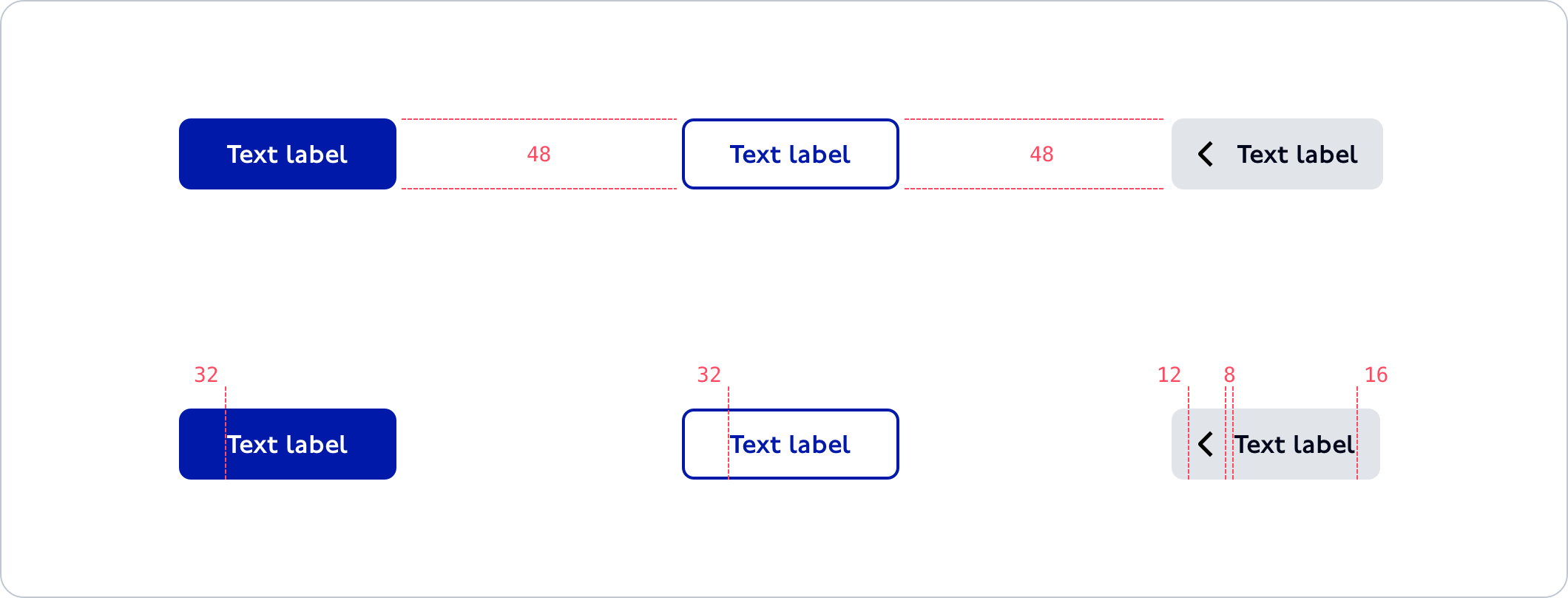
Guiding principles for positioning and using buttons
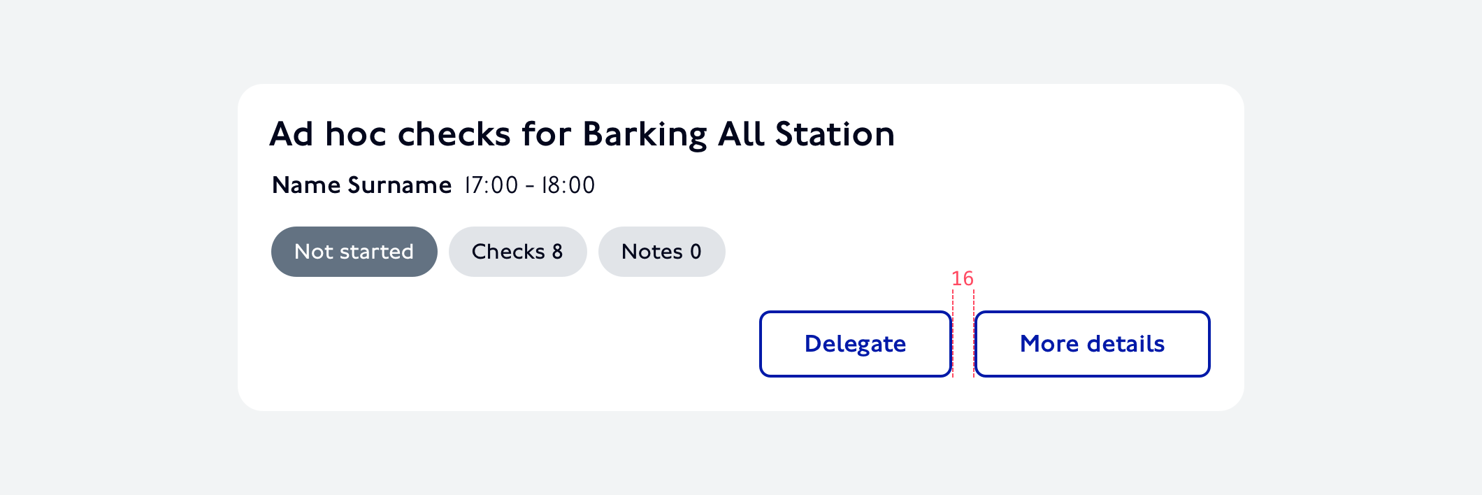
• Use a button to help users carry out an action, don’t use a button as a link
• Use one primary button per page view
• Position primary buttons to the left of secondary buttons
• Afford space around a button
• Too many buttons can create confusion, consider the UX and aim for clarity
Primary button positioned left
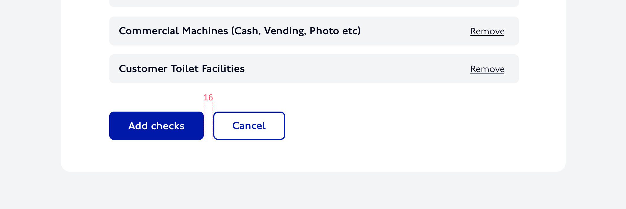
Secondary buttons for options
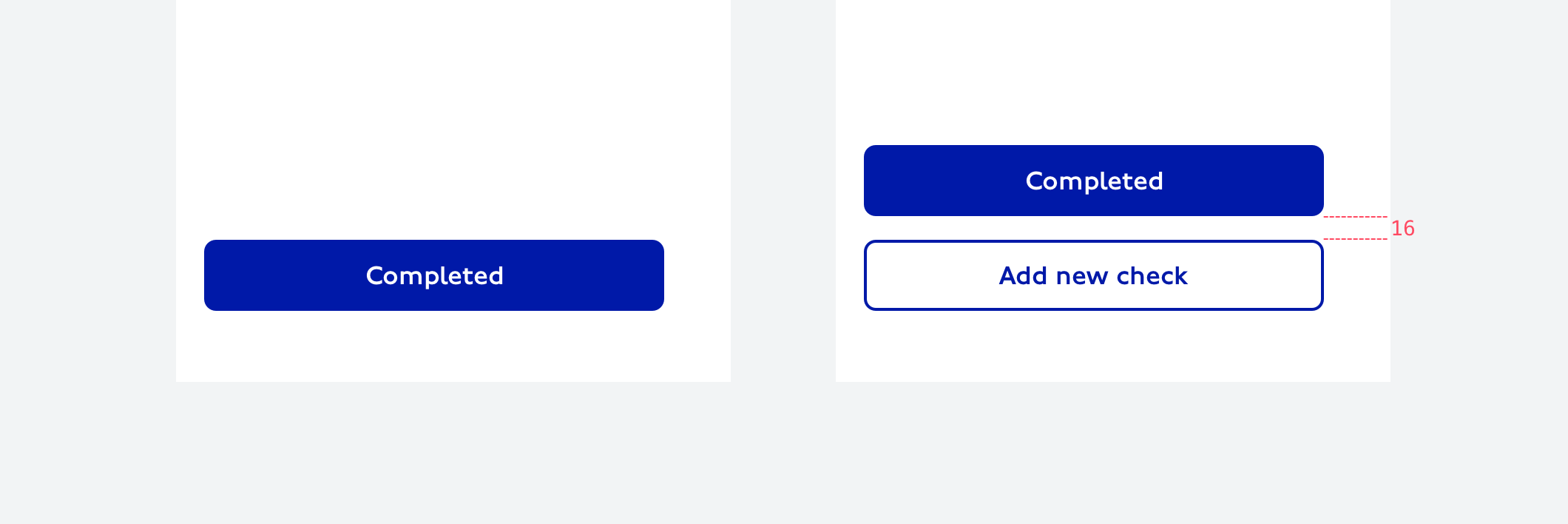
On mobile, primary and secondary buttons fill the width of the container. Primary buttons stack above secondary.
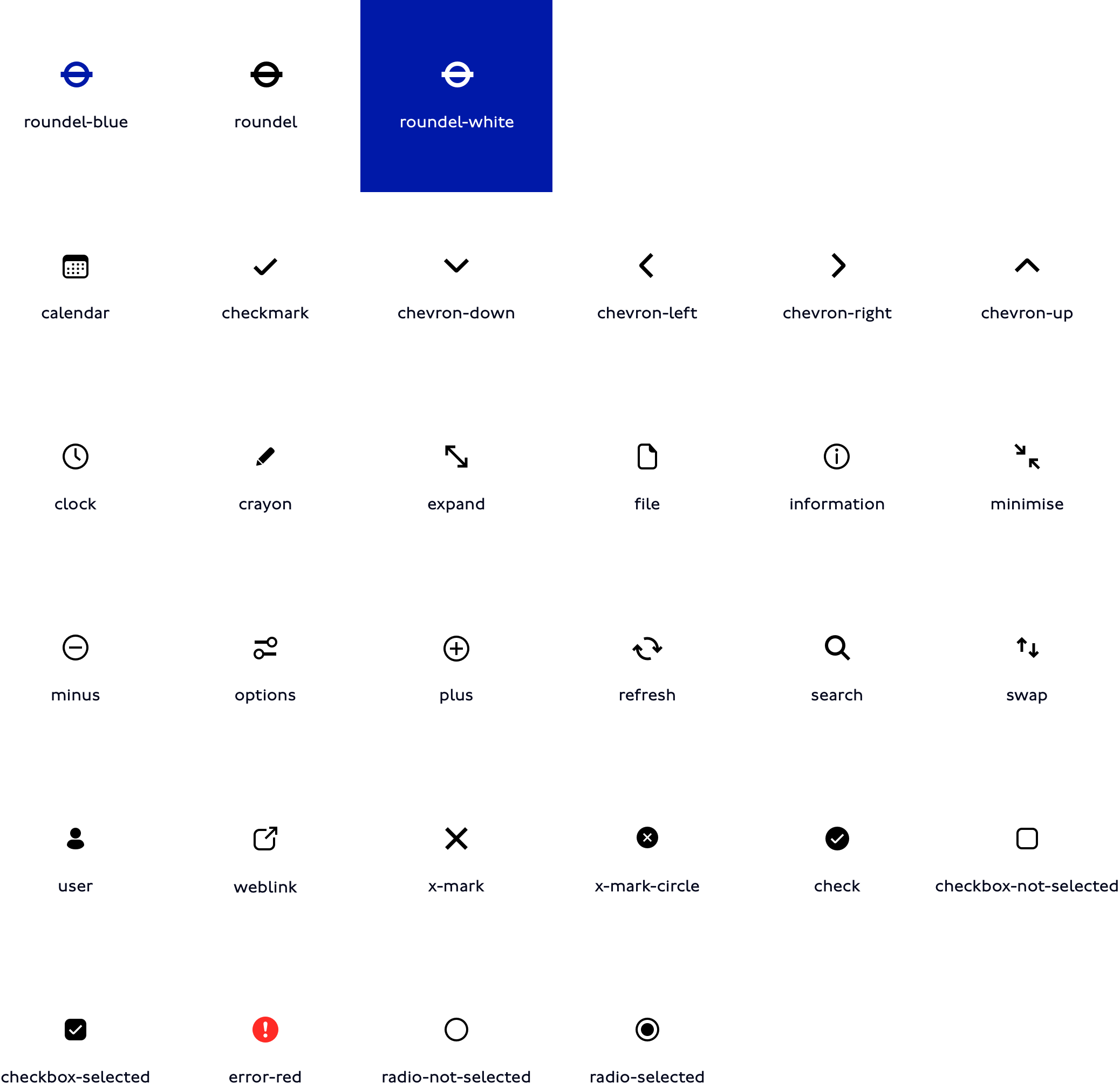
Icons
Icons are used to communicate messages at a glance, afford interactivity, and draw attention to important information.
Don’t
• use an icon unless it is necessary, prioritise words for communication
• enlarge an icon to use as an illustration
• consider an icon as decoration. It should aid intelligibility.
• change the colour of icons
Digital icons are an important and integral part of the TfL language. There are icons and symbols used for mapping, brand, UI interactions, payments as well as concepts such as busy or quiet times.
Please get in touch with us to request a full set of icons.
Core icon set
Structural elements
These are graphic devices which help in creating layouts. Successful layouts direct attention to the most important information and give users the means to take action.
Fills
Light greys can be used as backgrounds to define content areas or patterns, don’t use shadows or outlines to acheive this.
Rules and dividers
Reserve rules for tables rather than to separate content, instead use the spacing scale to group or separate elements into meaningful chunks or a use a background fill.
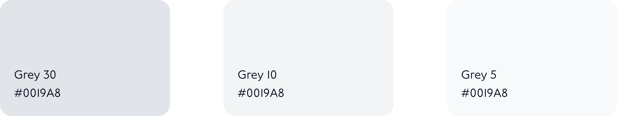
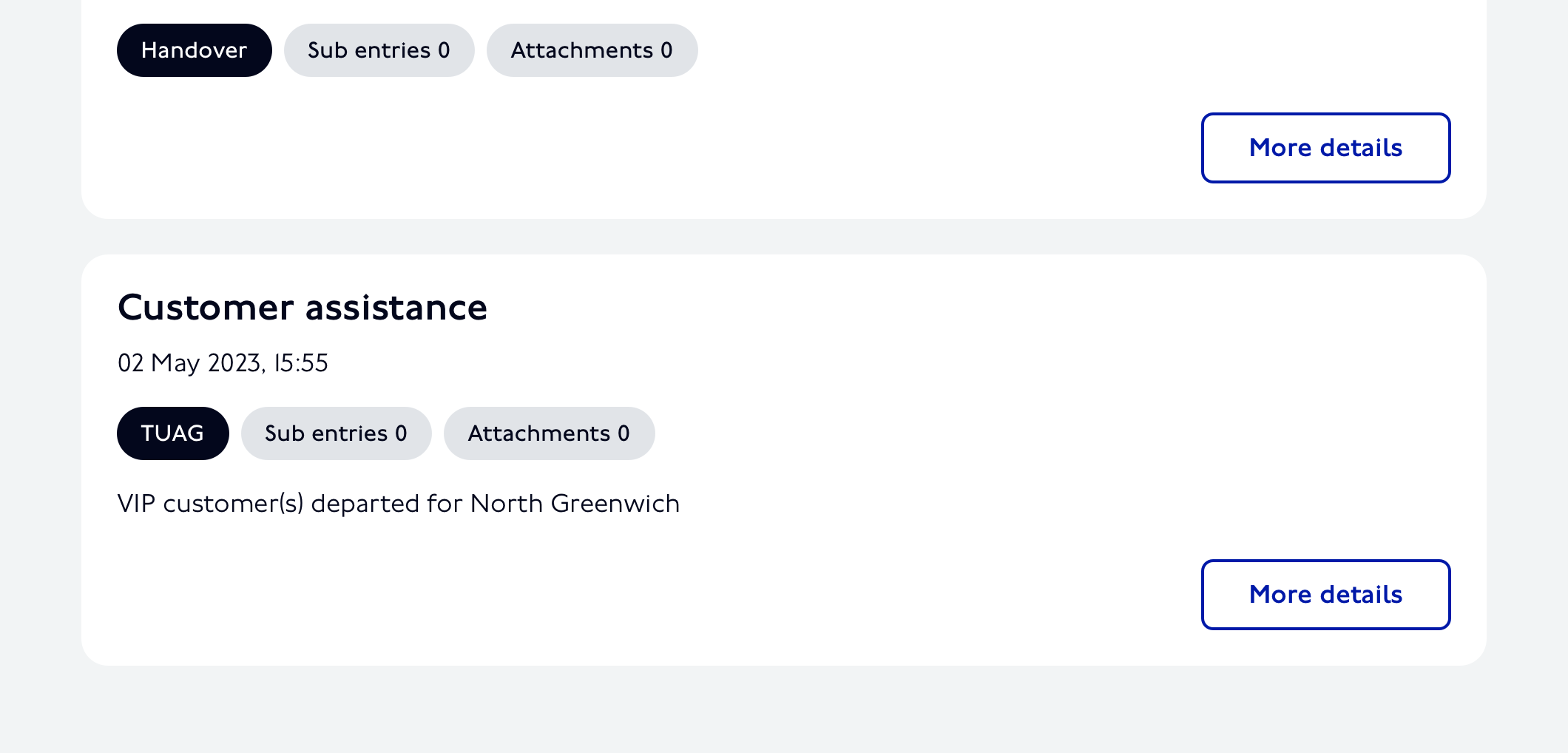
Grey 10 used as a background to define the cards
Shadows
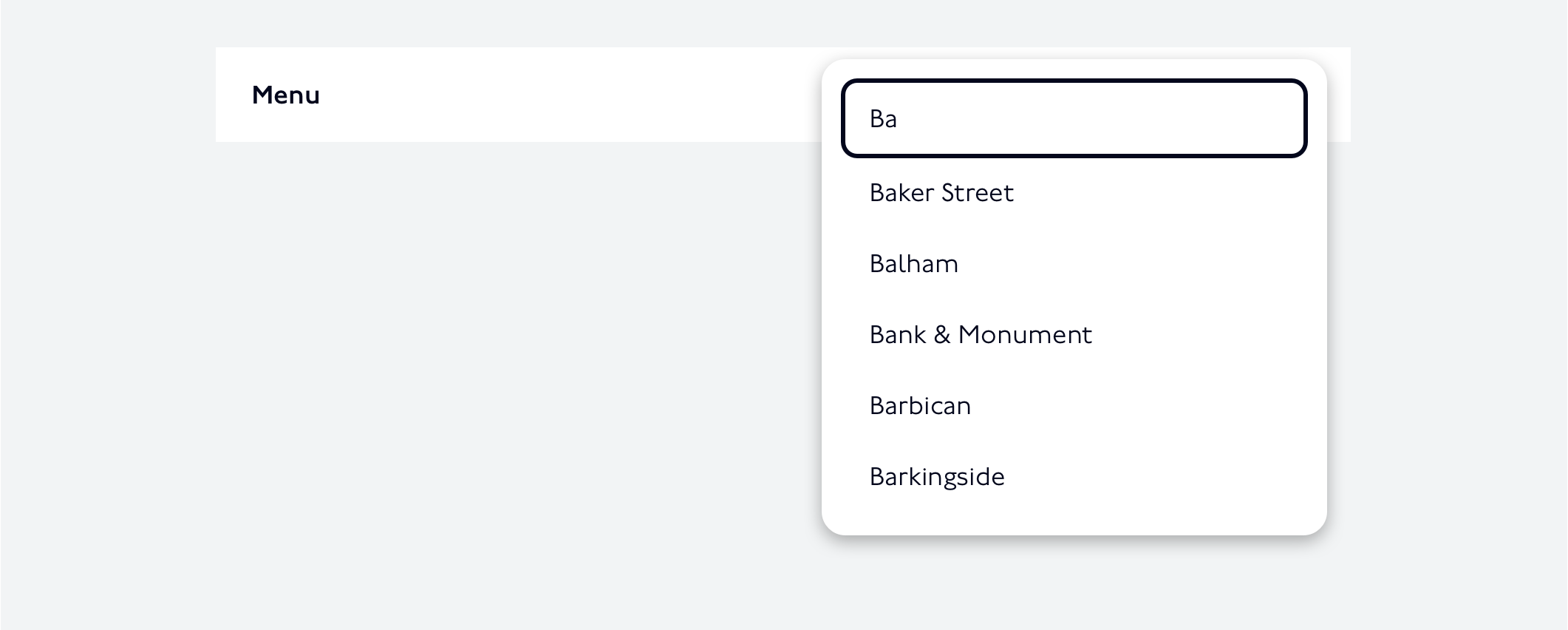
Shadows express elevation, they are primarily used for temporary elements which appear above other content creating focus on the UI component.
Shadow used to temporarily display a typeahead component