A live Tube map for London
In summer 2020, Transport for London launched a bold new approach to digital mapping — an adaptive, live Tube map — made entirely of code.
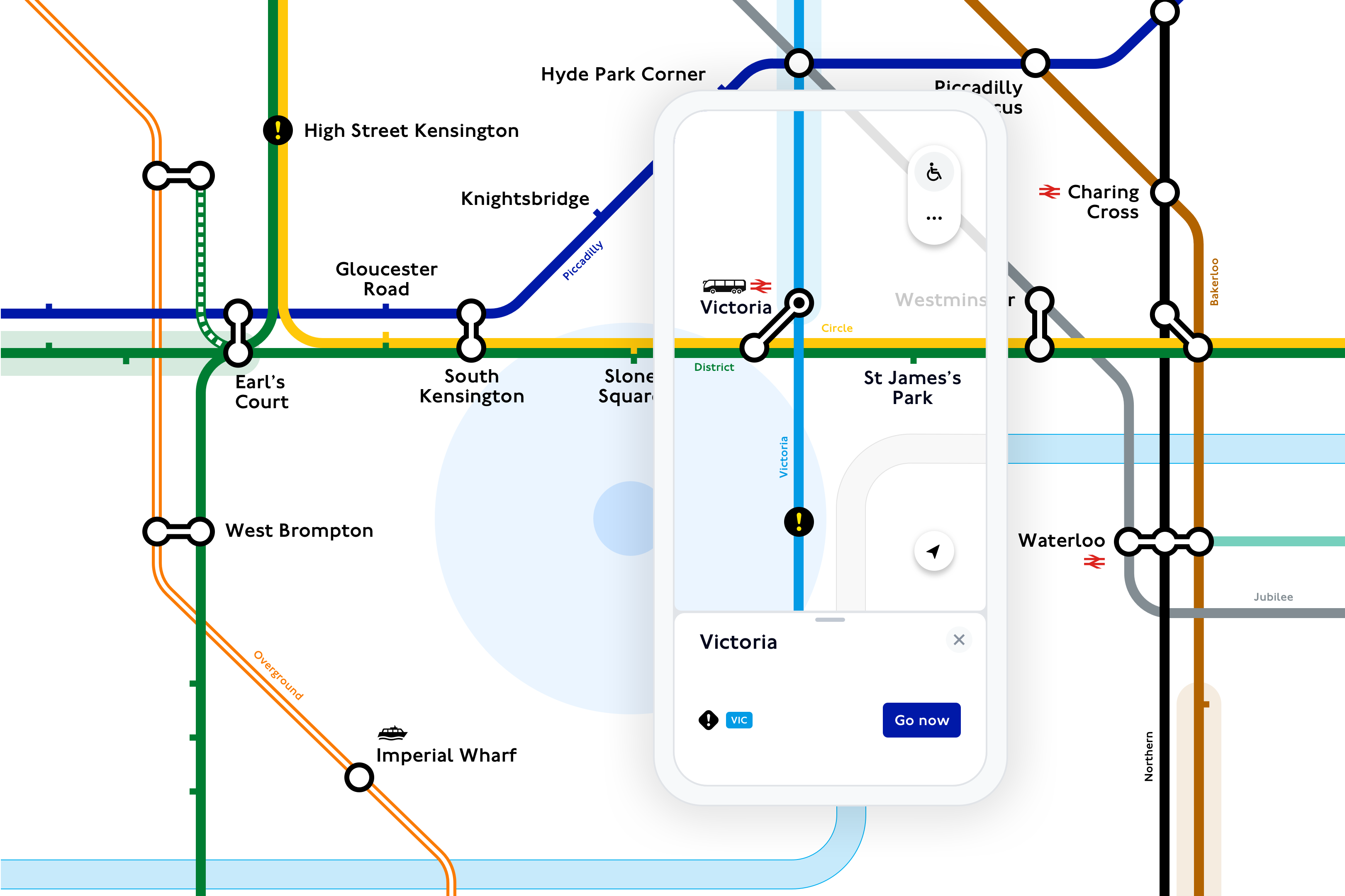
The map builds on Harry Beck’s original idea for a map of the London Underground system, which showed how journey connections are made across London, rather than being specifically geographical.
Since its creation in 1937, the map has undergone various design changes as it adapts to fit within a modern transport network. This has included adding more lines, more interchanges and more detail such as accessibility data as well as fare zones.
“The Beck map is instantly recognisable around the world and is one of the most important pieces of twentieth century communication design. Every change is scrutinised and debated by users and our job is to ensure that it can continue to perform its primary function of helping people get from A to B in as simple and direct way as possible.” Jon Hunter, Head of Design at Transport for London

“The Beck map is one of the most important pieces of twentieth century communication design.”
Launched during the height of the Covid-19 pandemic, the TfL Go app gives a live overview of the Tube, showing closed stations and disruptions at a glance — something that’s impossible with conventional mapping platforms.

As you pinch and swipe, the map responds to touch, allowing users to adapt the map quickly and transition between live travel information and map views such as showing what stations across London are step-free.
The potential of this new approach to digital mapping is therefore instantly clear — the map focuses on what’s important — a concise, live view of London.

Less noise, more meaning
Showing transit lines and their connections — rather than a geographically accurate map — helps make sense of a complex city such as London.

The map is made up of modular elements that can be rearranged in different useful patterns — for example lines or journeys — and most transit maps and wayfinding systems today, are based on this consistent, versatile, modern design language.
Nevertheless, the format has never seriously been adopted by digital platforms.
Previously, transit maps have been constrained by the sizes and dimensions of paper, far removed from a digital world, and largely built on geographic data.
With the release of TfL Go, we are closing the gap. “We need to keep rethinking how maps can adapt to new technologies and help us make sense of a constantly changing world — how maps can make cities inclusive, understandable and interesting to explore.” — Hanna Kops, Head of Experience, TfL Digital
“We need to keep rethinking how maps can adapt to new technologies and help us make sense of a constantly changing world”
Made up of code, the new map combines useful information — hidden across various versions of print maps and leaflets — with live data. This turns the Tube map into a modern and inclusive tool for all Londoners.

“From the beginning, it was clear that what is the norm in static map design would not be enough. Our new approach has made it possible, to engage with a real diverse set of Londoners, in defining what good design means for inclusive maps and how underlying data sets could be shaped. Inclusion has been a driving factor for innovation.” — Vanessa Uvoni, Design Lead, Inclusion
“Our new approach has made it possible, to engage with a diverse set of Londoners, in defining what good design means for inclusive maps”
A new tactile, adaptive mapping language
Most transit maps are still created manually by cartographers and often contain unique little quirks and workarounds.
With TfL Go – we have created everything in code and moved away from manually fine-tuned maps, without losing the details of craft.
“We’ve shaped a new digital wayfinding system that feels familiar and instantly recognisable. The well-loved design of the Beck map has been extended and adapted to respond to touch and live events.” — Alex Gray, Lead Product Designer
“We’ve shaped a new digital wayfinding system that feels familiar and instantly recognisable.”

By adapting the existing map’s elements within printed maps and wayfinding signage, we have produced the building blocks for the new digital map.
The new map introduces carefully crafted digital behaviours — the ability to adapt to live data and to respond to touch.
Little details, like slightly moving labels or a light feedback on touch, turn the map into something tactile. Transitions between views are thoughtfully designed to not distort proportions. Live data flows in and out, highlighting disruptions in subtle ways and acting as one with the digital map rather than being an overlay or afterthought.
As in other digital maps, interacting with the map reveals additional layers of useful information — the names of Tube lines appear as you look closer at a station — only the main interchanges and airports show when looking at London as a whole.

To ensure the design remains true to the Beck design, the code uses algorithms to generate curves at different angles and to keep the weight of lines consistent. This helps ensure the map doesn’t lose its iconic design.
“By drawing the Tube map with code, we can easily switch between live, data-driven versions of the map, such as the new step-free map, while keeping the essence of Harry Beck’s original idea. To show your location — the blue dot — we developed a new in-house iPad app that links geographical data points with the dynamically generated schematic map.” — Rowan Jones, Development Lead
“By drawing the Tube map with code, we can easily switch between live, data-driven versions of the map, such as the new step-free map, while keeping the essence of Harry Beck’s original idea.”


As well as the map, the new design language is also used to illustrate the journey and line diagrams within TfL Go.

“The flexible, modular elements adjust and expand to reveal details that bring the live nature of the map to every planned journey, showing what’s happening in the moment. This is very useful for simplifying complex routes that otherwise can be easily overwhelming.” — Daniela Barbeira, Product Designer
“Modular elements adjust and expand bringing the live nature of the map to every planned journey.”

We are now working on phase two of London’s live Tube map and there is more to come.
Download TfL Go to see the Live Tube map