 The familiar design of the blue dot
When designing the live Tube map for TfL Go, we realised displaying the user’s location on the map would greatly improve the experience. We wanted to bring the familiar design of a blue location dot, like that found in Google / Apple maps, to the iconic Tube map.
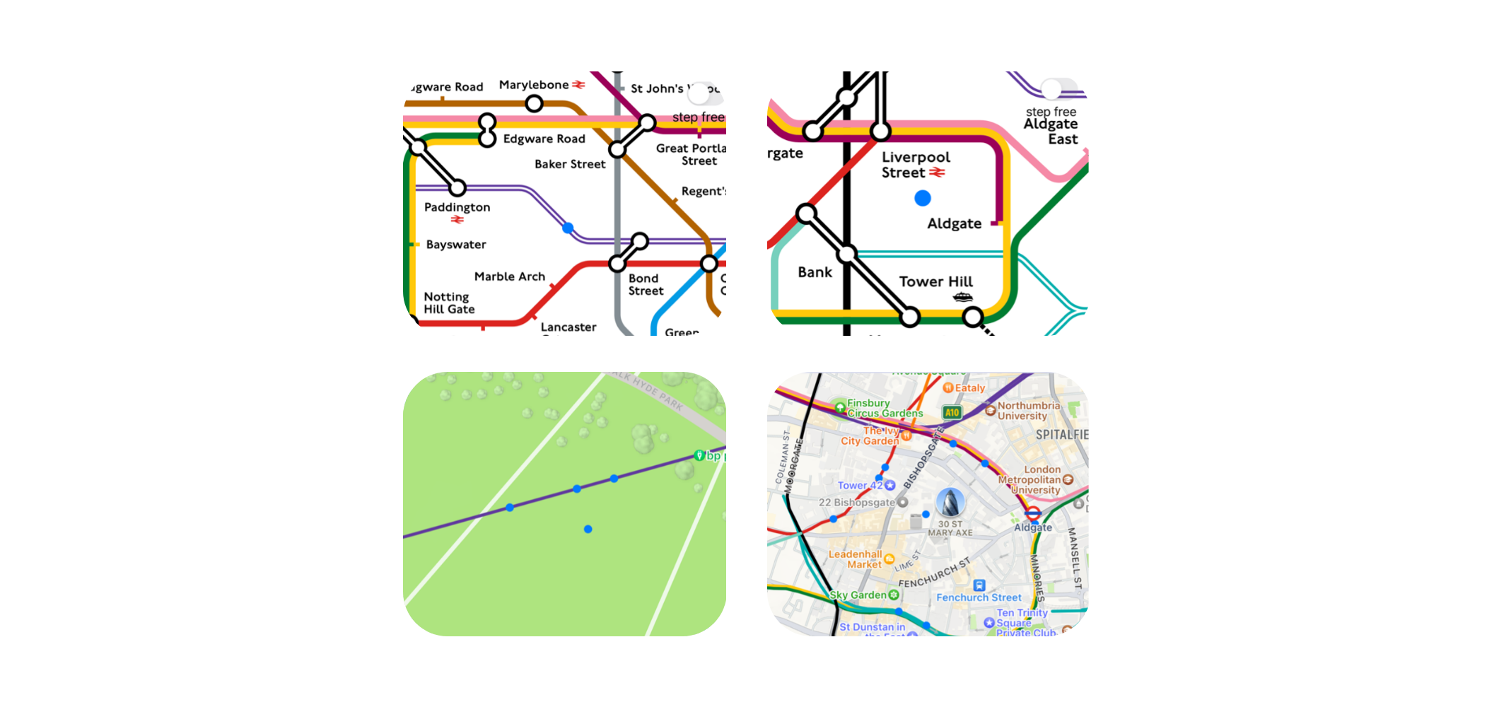
The Tube map intentionally deviates from the actual geographical layout of lines and station to improve clarity and usability. This is achieved by simplifying lines with 45-degree bends, spacing stations more regularly and enlarging central London, emphasising the relationship between stops, rather than their exact geographical locations.
Showing a user’s location in this distorted 2D space would prove challenging, especially when their location is not close to a line or station.
“We have data for the positions of lines and stations on both maps and we needed a tool to link these two data sets.”
To drive the blue dot, we needed to link the two-dimensional space of a geographical map of London with the distorted space of the schematic Tube map. We have data for the positions of lines and stations on both maps and we needed a tool to link these two data sets.
A unique mapping tool
We created a new internal iOS app to achieve this and included functionality to enable us to visualise the mapping between the two data sets and tweak this where necessary.
The mapping could then be exported from the app as a file containing a huge list of pairs of points spaced 50 meters along every line. These pairs include a geographical coordinate (longitude, latitude) and the corresponding Tube map canvas point (x, y).
Using the coordinate to point mapping data file, we developed an algorithm that takes the user’s location coordinate and finds the closest point on a line on the Tube map.
This starts by finding the nearest coordinate on a line, calculates how far this point is between the two adjacent stations, then finds the canvas point in the same proportion along the line on the Tube map.
“The ‘snapping’ algorithm is ideal when the user is close to a line, as it snaps the blue dot to the closest point.”
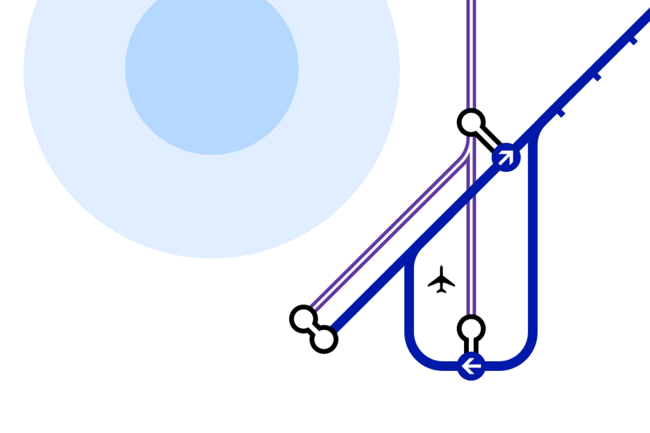
This ‘snapping’ algorithm is ideal when the user is close to a line on the map, as it snaps the blue dot to the closest point along that line. When the user is further away from a line, this snapping behaviour isn’t desirable, so we developed another algorithm better suited to finding the ideal position for the blue dot in empty spaces on the Tube map.
This algorithm works by finding the closest geographical coordinate on a line in 8 directions (octants) from the user’s location. The distance between pairs of these 8 coordinates is then calculated and by comparing to the distance of the 8 corresponding points on the Tube map, we can approximate the average scale (ratio between distances on each map) at the user’s location.
Fading between algorithms
Now we can calculate the distance and angle from the user’s location to each of the 8 surrounding geographical coordinates and using the same angles and scaled distances, triangulate 8 Tube map canvas points (approximations of the user’s location on the Tube map).
The blue dot is then placed at the average of these 8 canvas points. By weighting the points according to proximity before averaging, we achieved more desirable results. We now have two algorithms, the snapping algorithm suited for locations along lines and the triangulation algorithm suited to locations between lines.
The final location algorithm used in TfL Go combines the output of the snapping and triangulation algorithms seamlessly, depending on the user’s proximity to a line. If the user is within 25 metres of a line, we use the 100% of the snapping algorithm, between 25 – 75 metres we fade between the two algorithms, and beyond 75 metres, we use 100% of the triangulation algorithm.
Thanks to this algorithm, TfL Go can now accurately display the user’s location on the Tube map. Next time you use TfL Go to explore London, keep an eye out for the blue dot moving on the map!