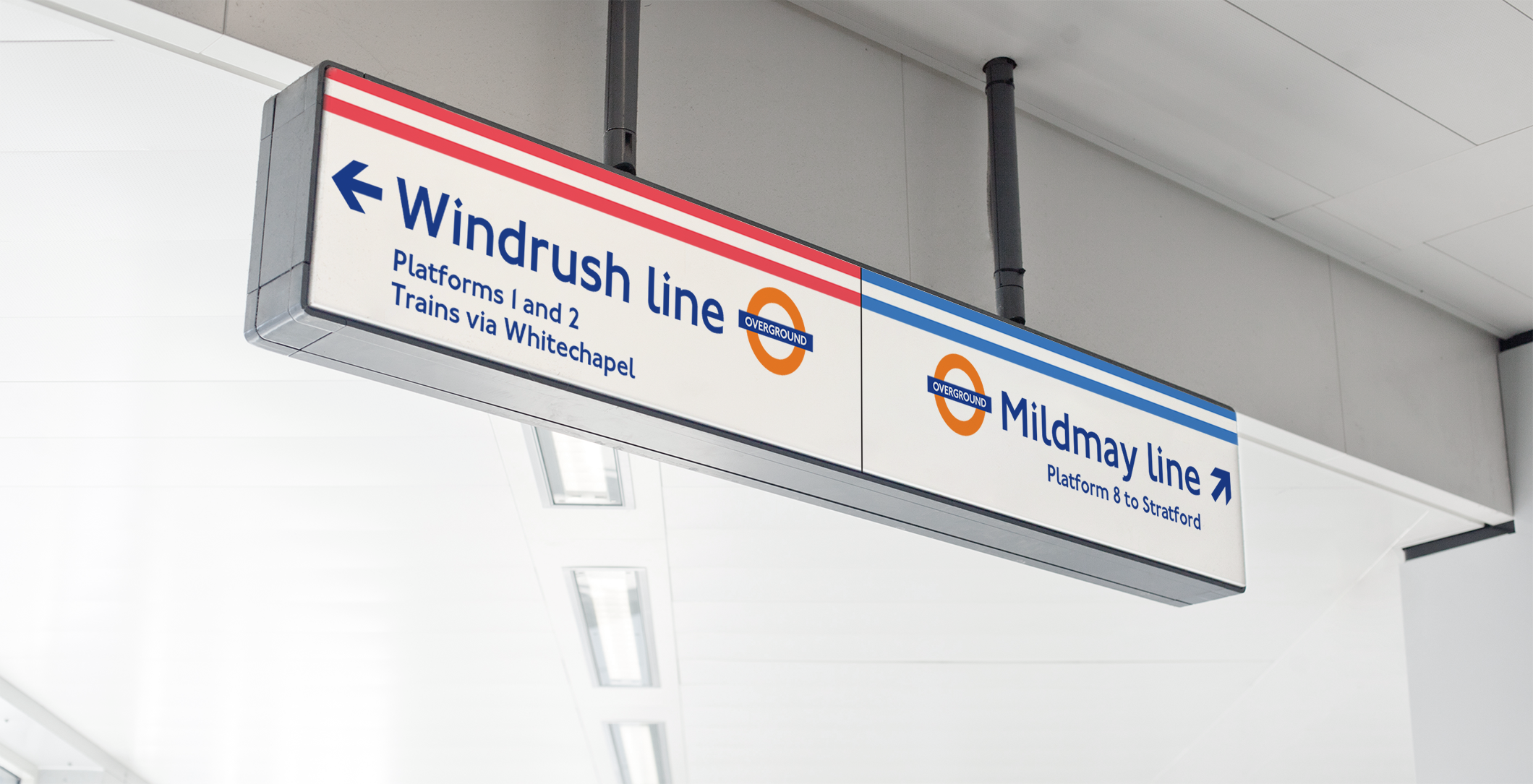
By the end of 2024, London Overground’s new line names and colours will have been introduced across our signage, maps and digital service, making it easier for customers to travel on the network.
You can read more about the significance and stories behind the new line names on our Made by TfL blog.
This guide is for suppliers and third party developers who are now planning to adapt their apps, websites and digital displays to reflect the changes by end of 2024.
It provides an overview of various scenarios you might encounter when updating digital travel tools and illustrates how you might approach them, so that your design aligns with the experience customers will have when travelling.
The lines

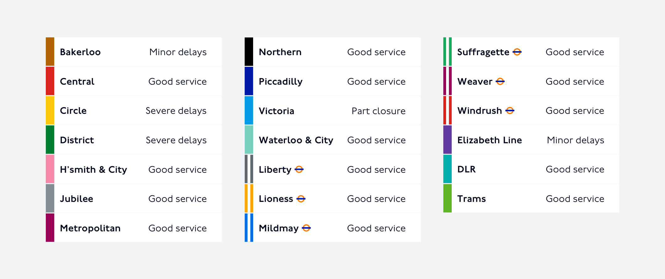
| Name | Currently known as |
|---|---|
| Liberty (LIB) | Romford to Upminster |
| Lioness (LIO) | Watford Junction to Euston |
| Mildmay (MIL) | Richmond and Clapham Junction to Stratford |
| Suffragette (SUF) | Gospel Oak to Barking Riverside |
| Weaver (WEA) | Liverpool Street to Enfield Town, Cheshunt and Chingford |
| Windrush (WIN) | Highbury & Islington to New Cross, Clapham Junction, Crystal Palace and West Croydon |
Map
All new London Overground lines will display dual lines in their respective colour.
You can see all the new lines on the new London Overground map.
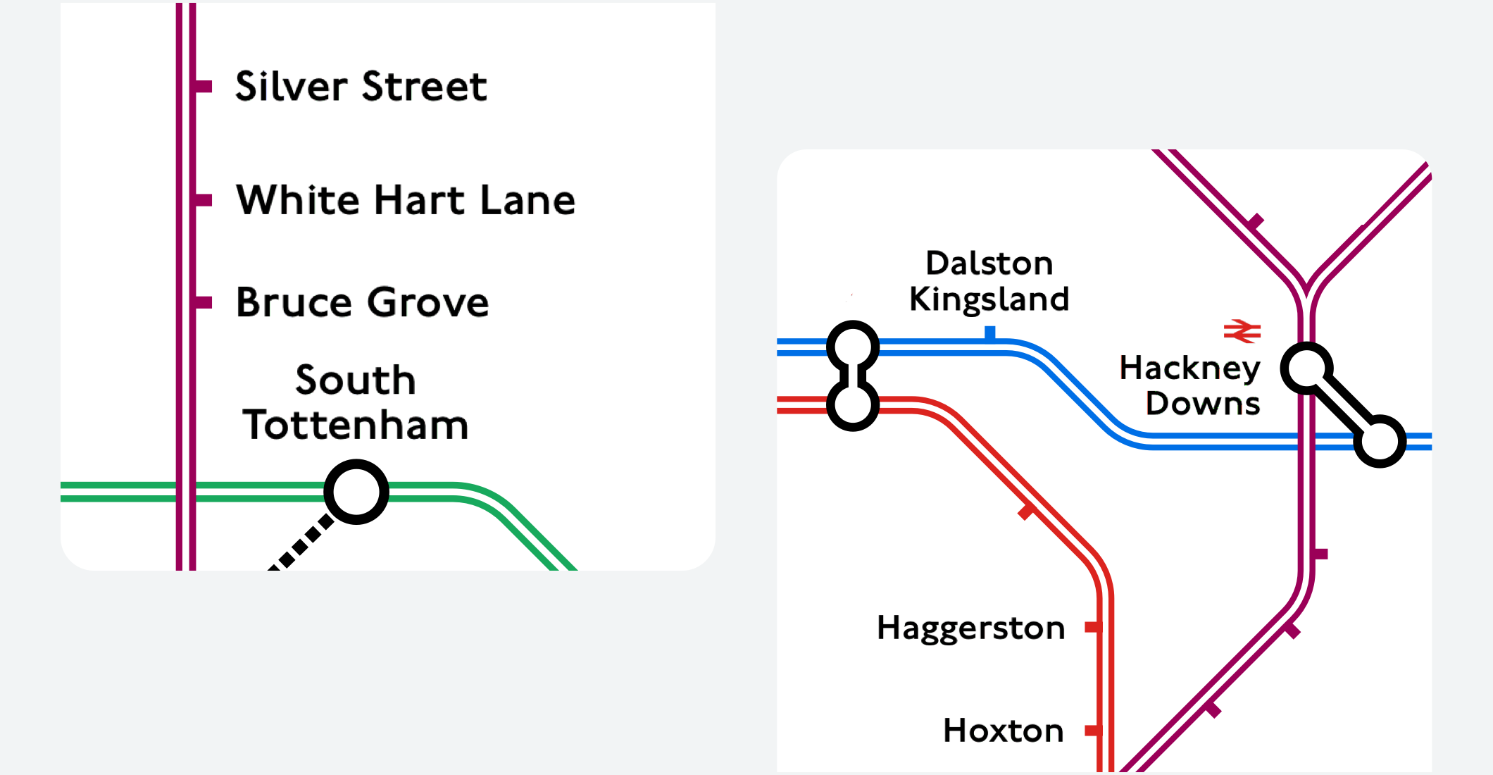
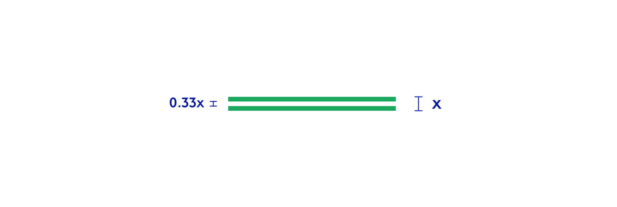
A dual line is composed of two lines and a white space of equal weight.
This will also be reflected in station signage and wayfinding.
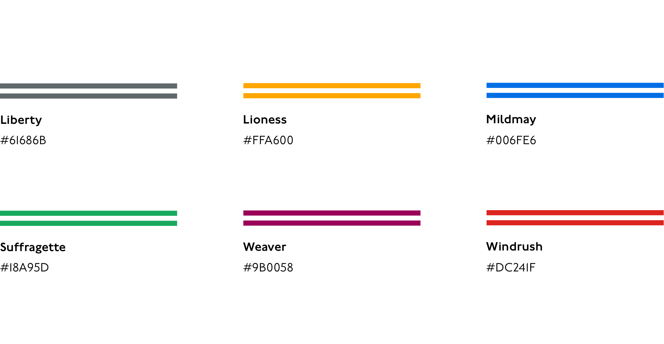
Colour values and abbreviations
| Name | RGB | Hex | |
|---|---|---|---|
| Liberty (LIB) | 97, 104, 107 | #61686B | |
| Lioness (LIO) | 255, 166, 0 | #FFA600 | |
| Mildmay (MIL) | 0, 111, 230 | #006FE6 | |
| Suffragette (SUF) | 24, 169, 93 | #18A95D | |
| Weaver (WEA) | 155, 0, 88 | #9B0058 | |
| Windrush (WIN) | 220, 36, 31 | #DC241F |
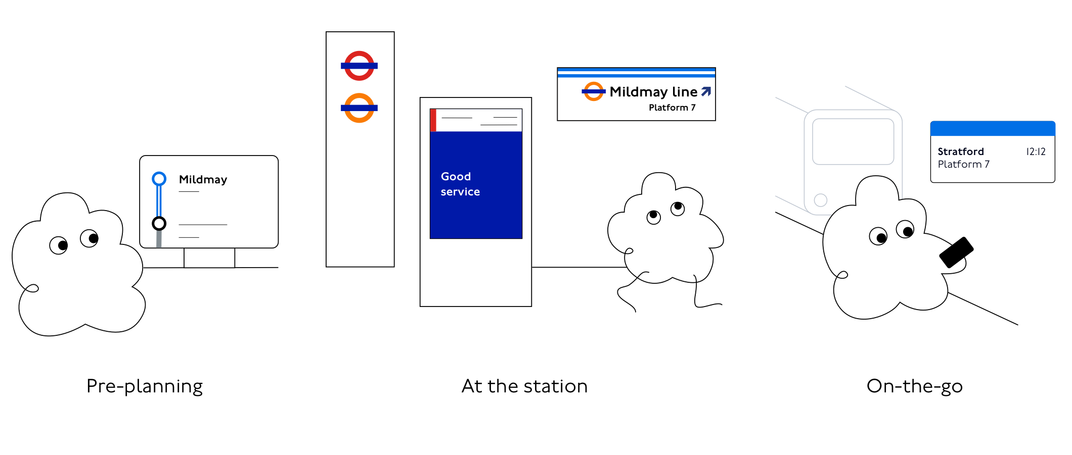
A customer journey
Customers will encounter the new names and colours along a journey, this might include planning ahead, finding the right station or platform and adapting to potential disruptions on the way.
The Overground brand will continue to guide customers when finding their way to the right part of the station or the right platform and will differentiate it from other modes of transport on our network, such as the London Underground or the DLR.
Status
Status information is often displayed in lists, cards, widgets, notifications and other assets. Frequently, these assets display an overview of multiple disruptions on the network, and a global indication of good service for all lines that are not disrupted.
Line colours can be applied to graphic elements to help customers identify them.
We will no longer present a single network-wide London Overground status. Status will always be displayed separately for each London Overground line.
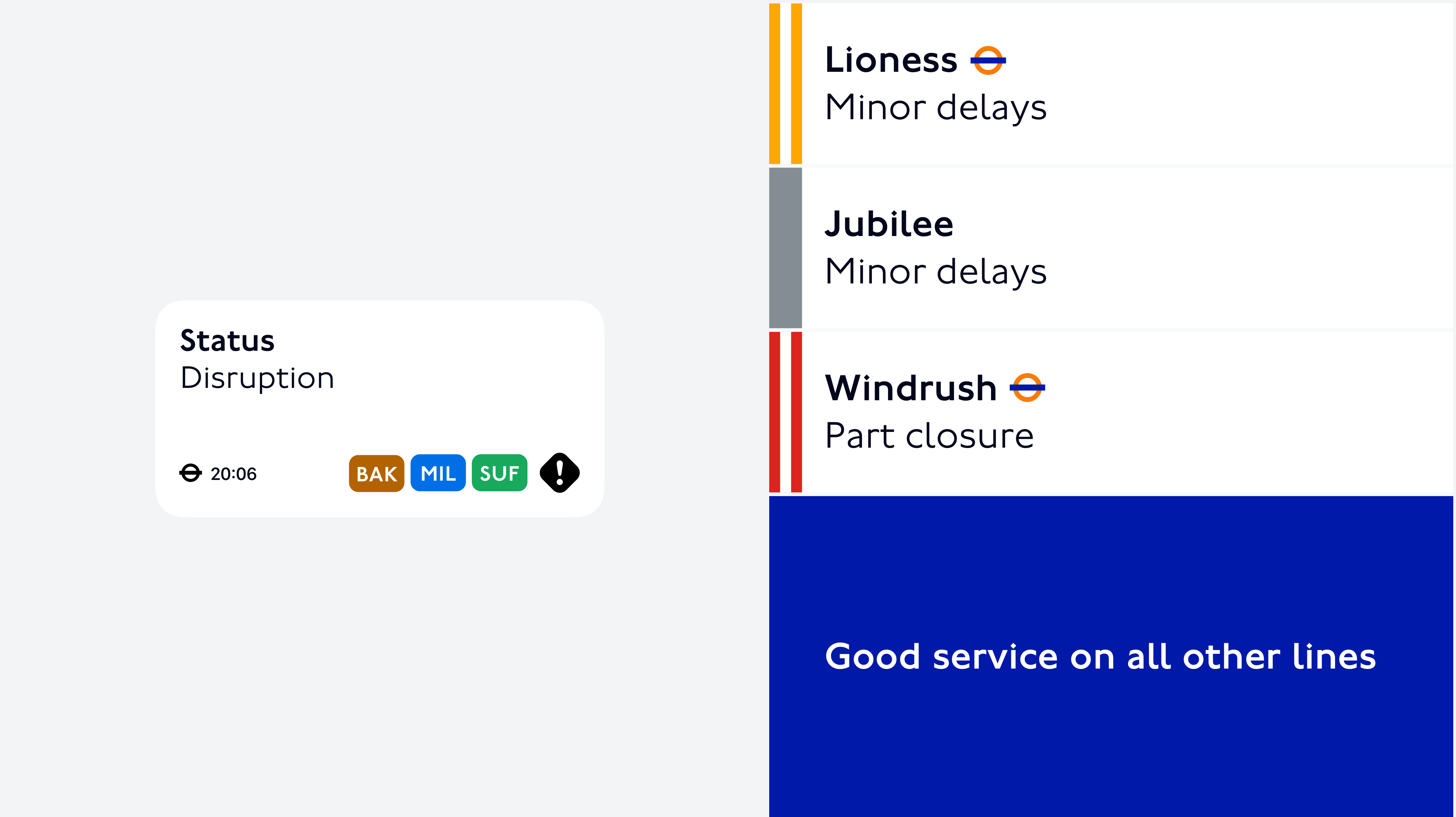
When showing status for all Tube & rail lines, make it easier for customers to distinguish the new Overground lines from other services with a dual line in their respective colour and ideally with an additional Overground roundel or label.
We recommend this approach for all lists of Tube & rail lines, beyond the context of Status.
Possible variations if necessary:
Dual lines must be displayed, however if this is technically not possible, the Overground line colour can, if absolutely necessary, be displayed as a colour block with a roundel or l
abel.
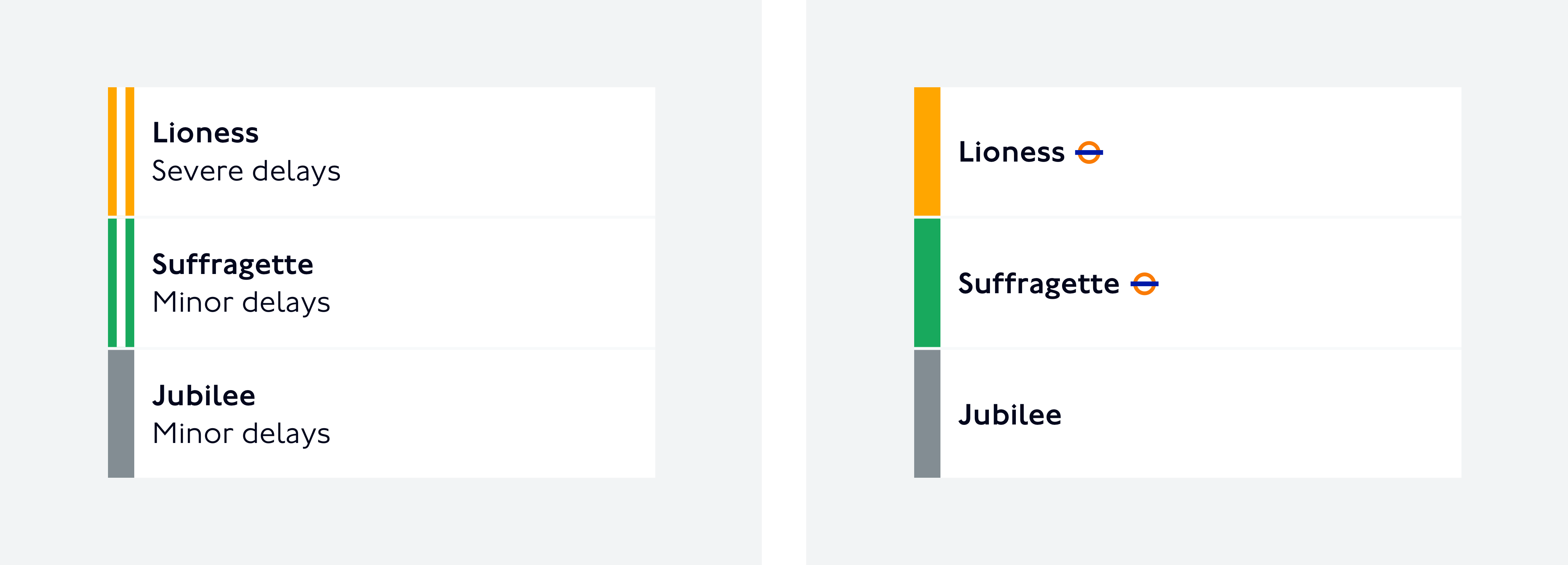
Status can also be displayed with text only.
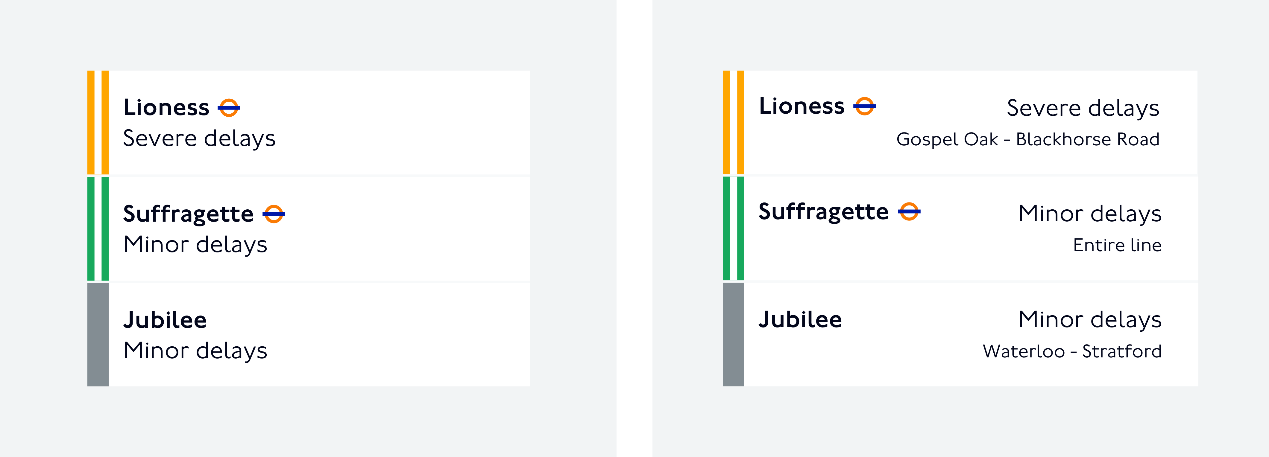
In some scenarios, you might need to display the complete list of all London Underground and London Overground lines with their individual status, wether the lines are disrupted or have good service.
In these instances, please organise the lines in the order described below, and identify London Overground lines according to the previously described visual guidelines.
There might be instances where you would like to give customers an overview of the volume of disruptions. In those cases, it is typically less important to distinguish between lines and more important to give customers a sense of the severity of the disruption.
If space is limited, visual indicators should be as simple and clear as possible to not add further complexity. There should always be an alternative text to be used by screen readers.
If using line name abbreviations, please refer to the list displayed above. Text placed on line colours should be set only in white or black, assuring color contrast follows accessibility guidelines.
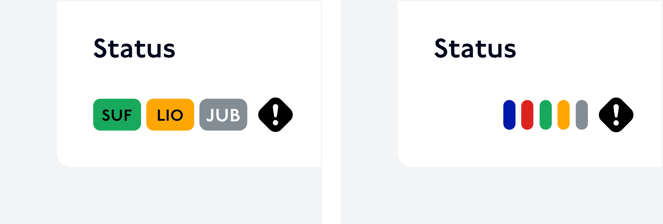
On screen readers, these would read as:
First example: “Status, disruption, Suffragette line, Lioness line, Jubilee line”
Second example: “Status, 5 disruptions”
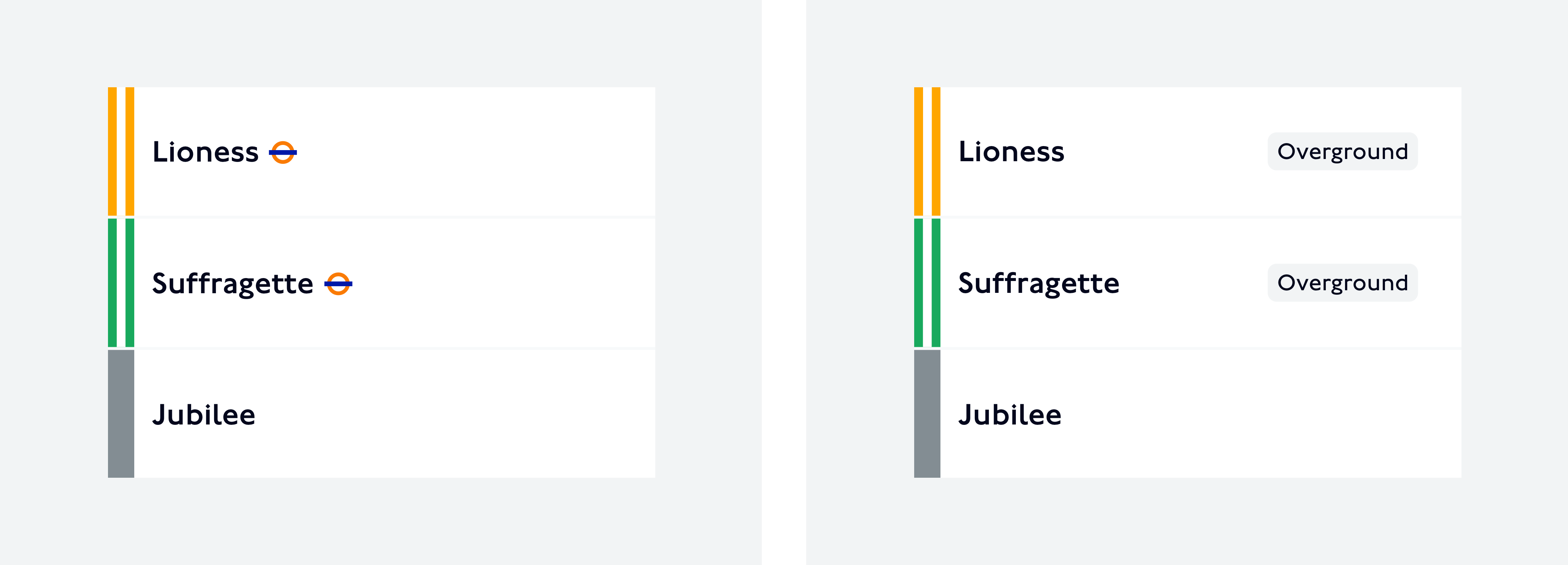
Stations
When looking up station information, it is important for customers to find the Overground part of the station or to know that there is an Overground line running from that station.
It is helpful to display mode icons next to station names, including Overground roundels.
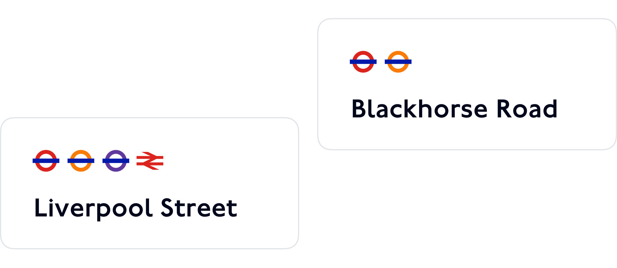
On screen readers, these would read as:
First example: “Liverpool Street, Underground, Overground, Elizabeth line, National Rail station”
Second example: “Blackhorse Road, Underground, Overground station”
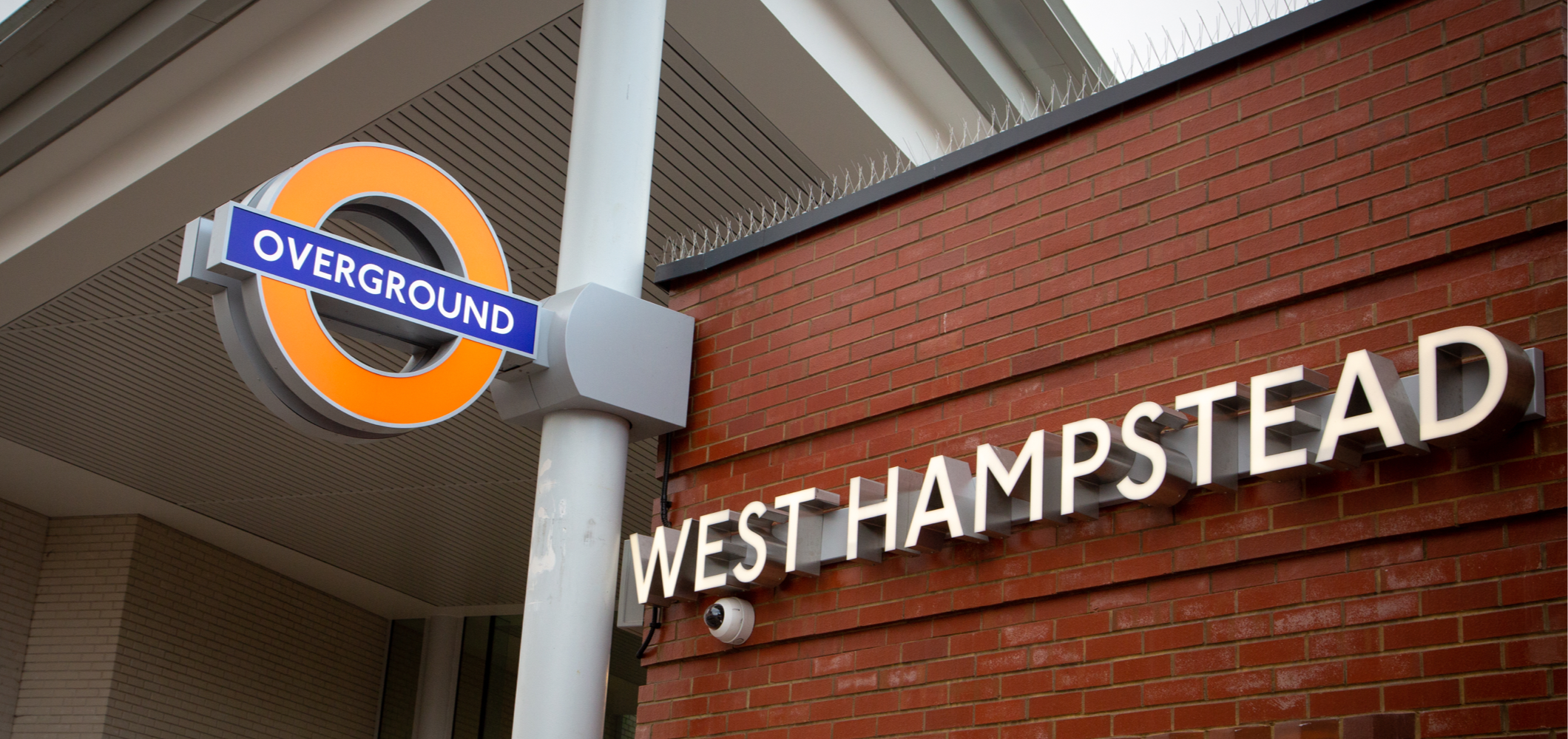
At the stations
Overground roundels will be displayed outside stations that include these lines.
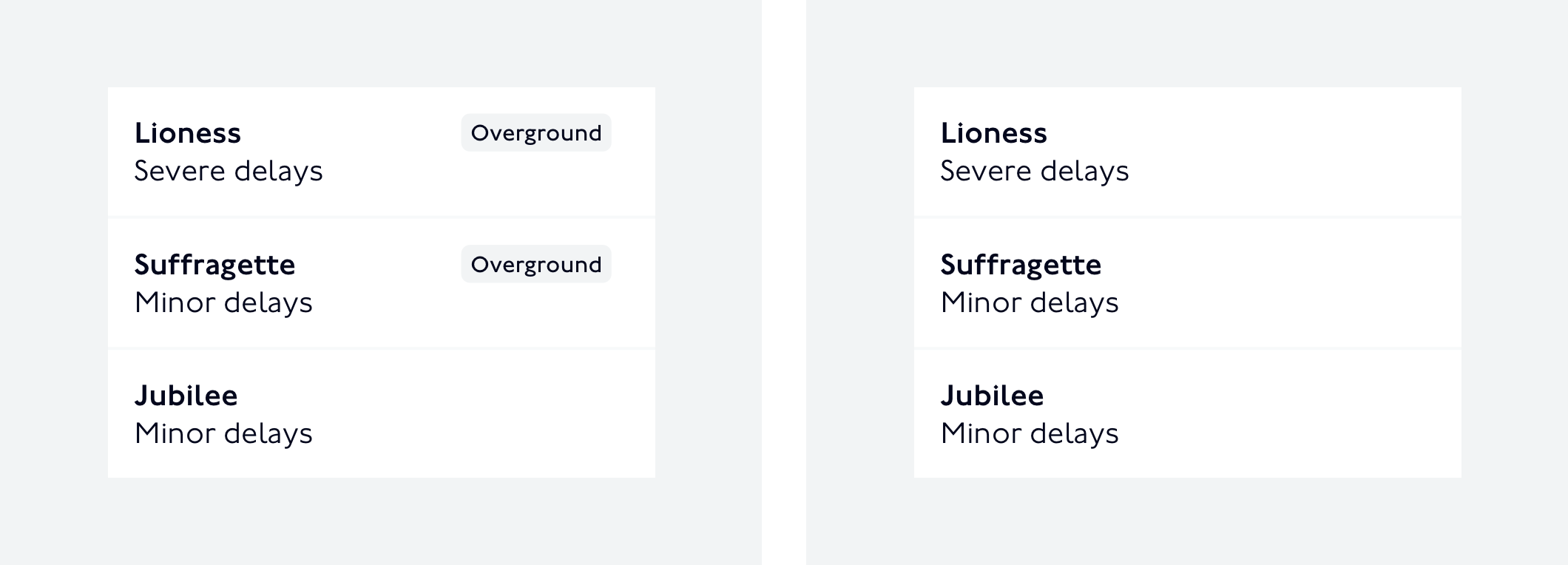
Station information
When showing information for a station with different services (e.g. Overground and Underground), it is helpful for customers to associate the relevant lines with the Overground.
Icons or labels can be used for this purpose, alongside the line colours.
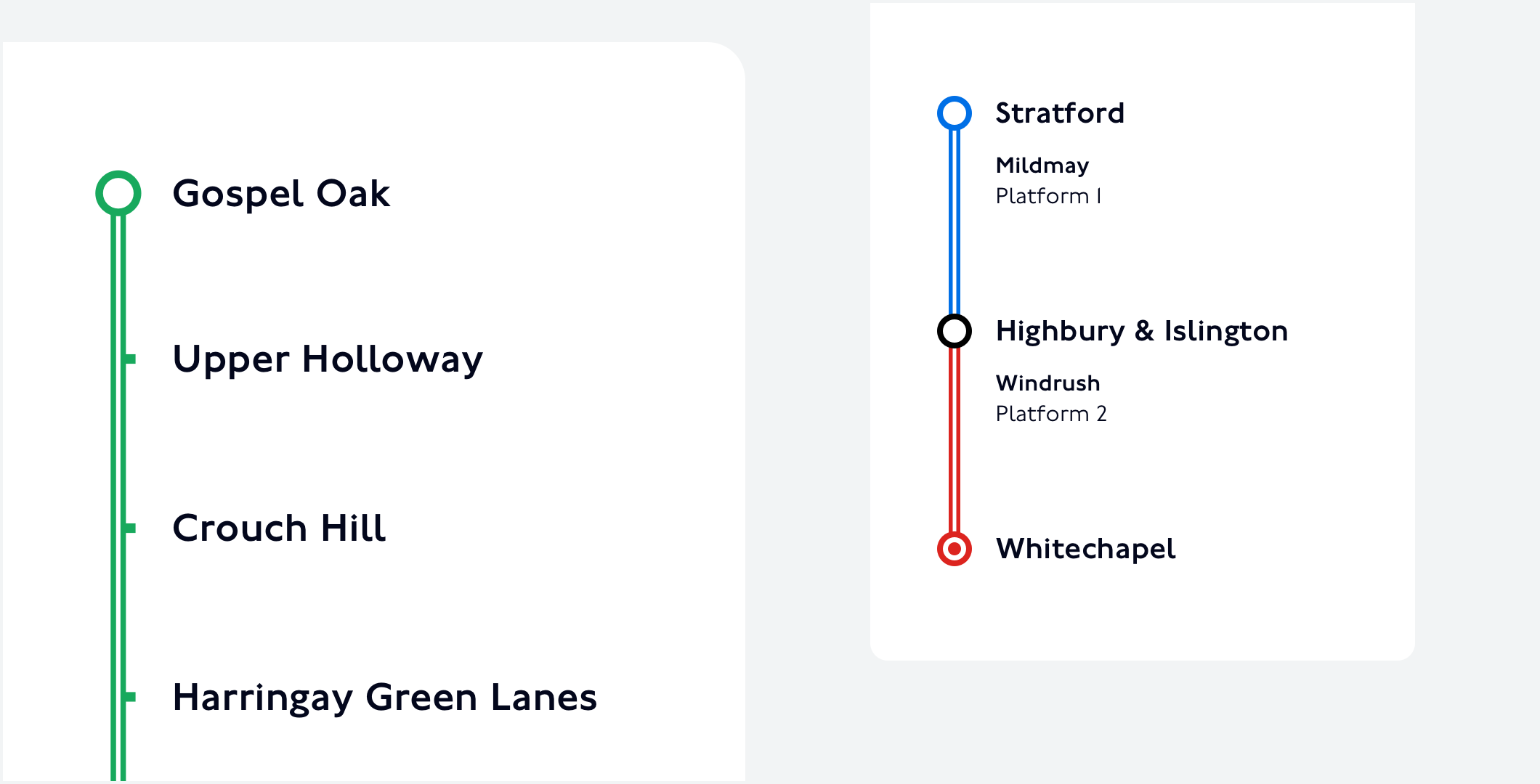
In the context of departure boards, the dual line can be replaced by a colour block, if it makes the information clearer.
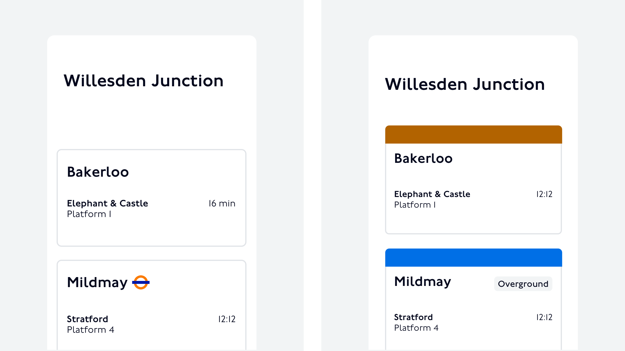
On screen readers, the left side image would read as:
“Bakerloo, Elephant & Castle […]; Mildmay, Overground, Stratford […]”
Search
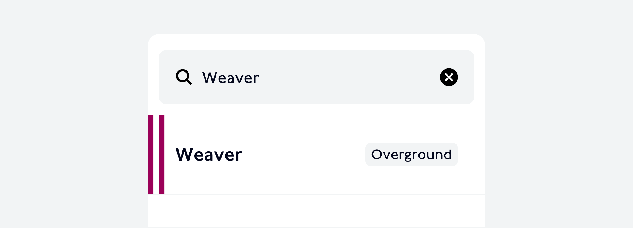
In search results for stations, it is useful to identify the services available. In this context, an Overground roundel can be included, as well as the line colours.
In those instances, it is typically less important to distinguish between lines and more important to give customers a sense for the interconnectedness of a station.
If space is limited, visual indicators should be as simple and clear as possible to not add further complexity and there should always be an alternative text to be used by screen readers.
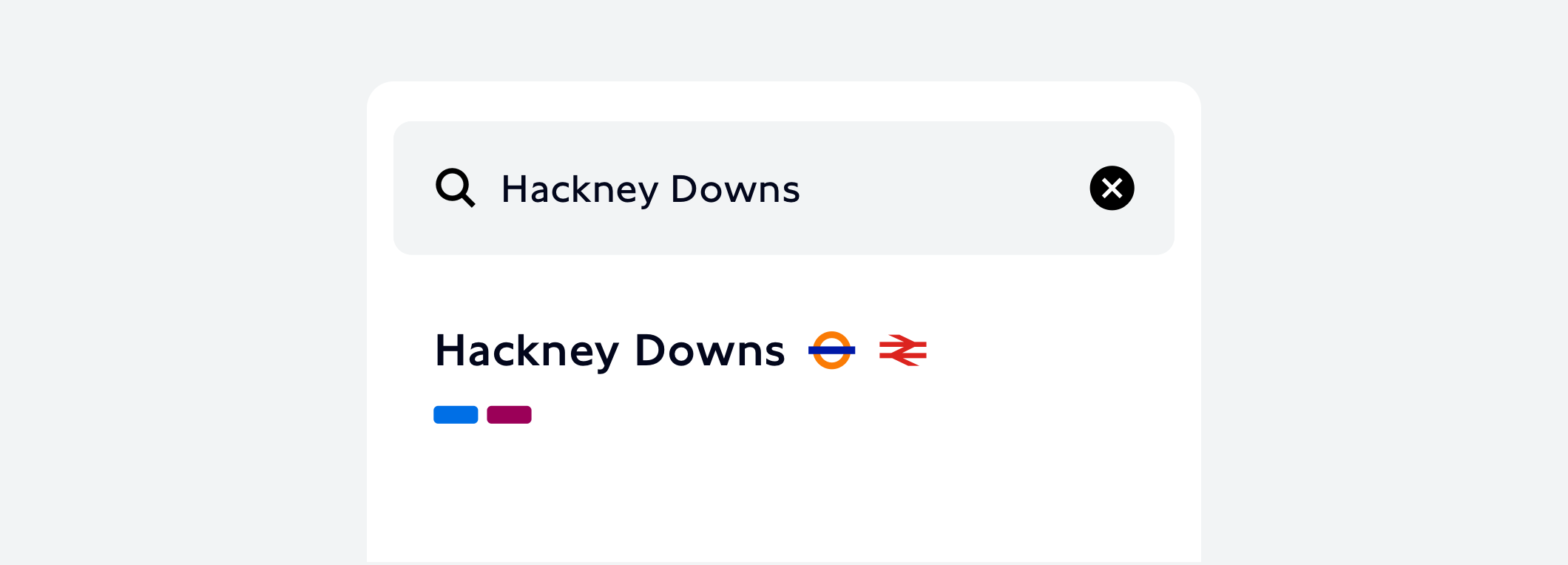
On screen readers, this search result would read as:
“Hackney Downs, Overground, National Rail station, Mildmay line, Weaver line”
In search results for lines, it is useful to display a graphic element in the respective line colour. It may be helpful to include double lines and an Overground label as well.
Journeys
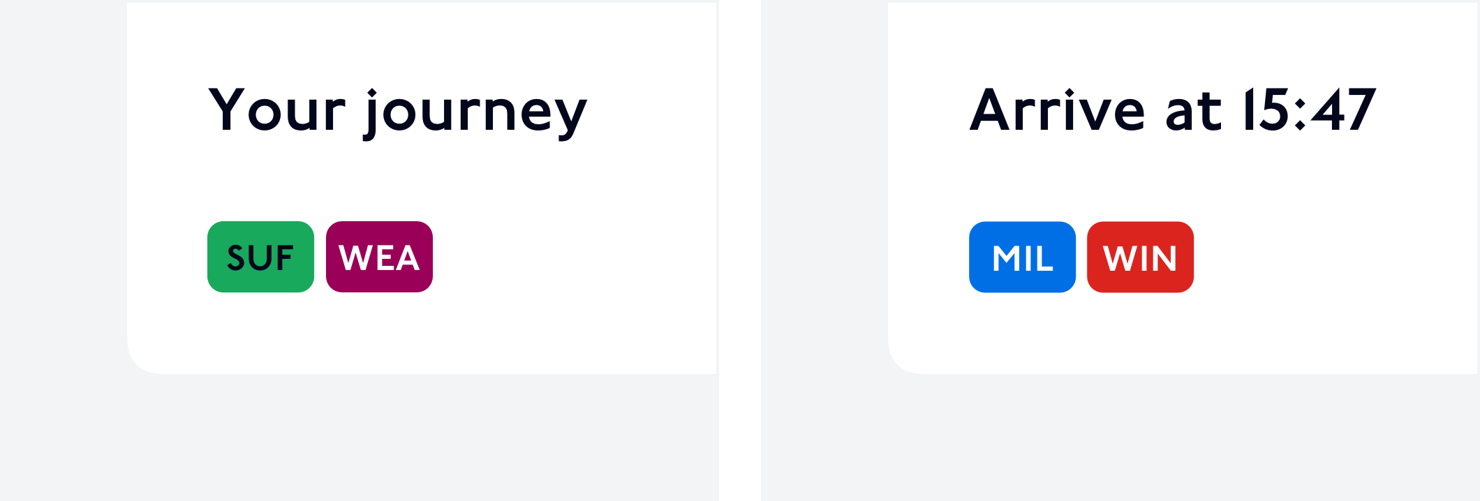
In journey diagrams, Overground lines will be displayed with a dual line in their respective colour.
Line name abbreviations and colour badges can be used to show journey summaries.
If using line name abbreviations, please refer to the list displayed above. Text placed on line colours should be set only in white or black, assuring color contrast follows accessibility guidelines.
On screen readers, these would read as:
First example: “Your journey, Suffragette line then Weaver line”
Second example: “Arrive at fifteen forty-seven, Mildmay line then Windrush line”
We hope this guideline is useful, however please reach out to us via the TfL Techforum if you have any further questions.